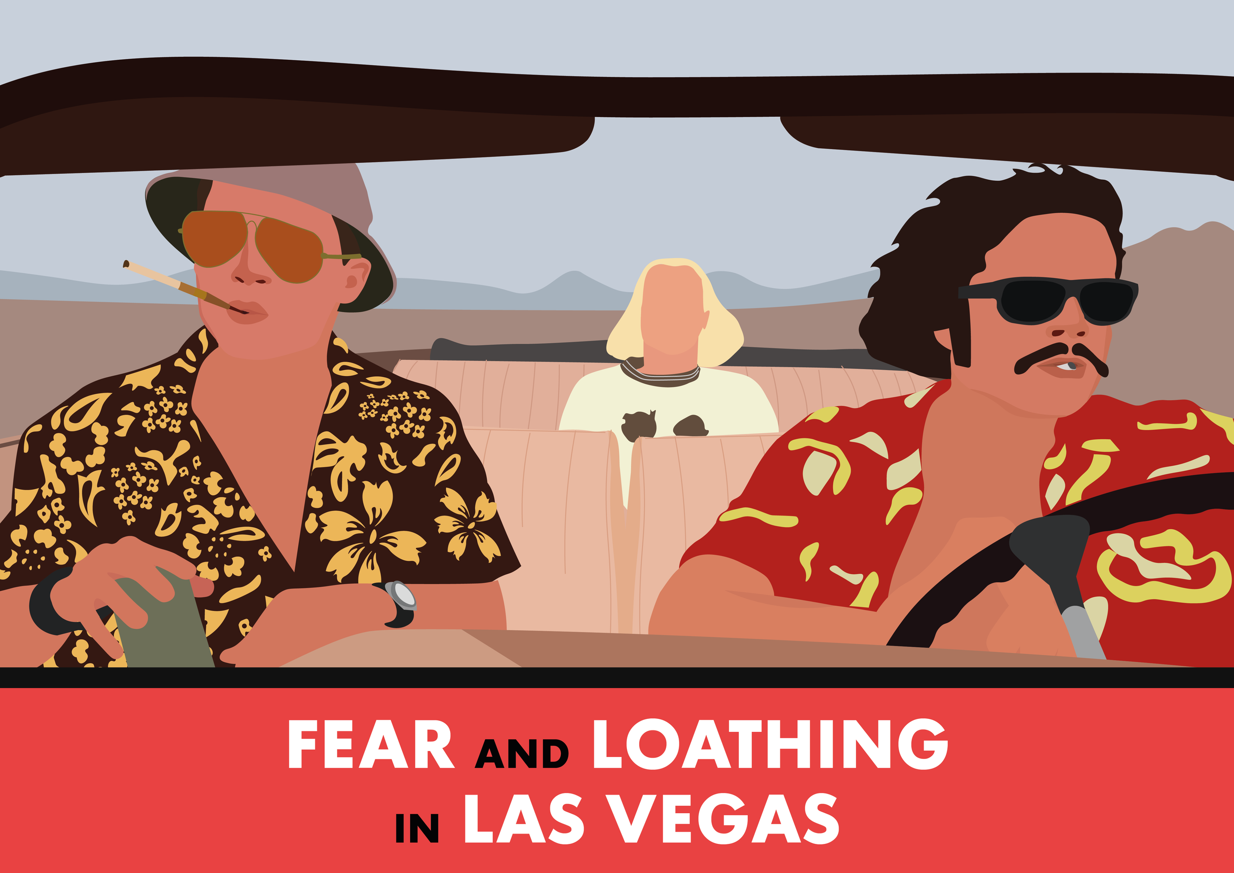
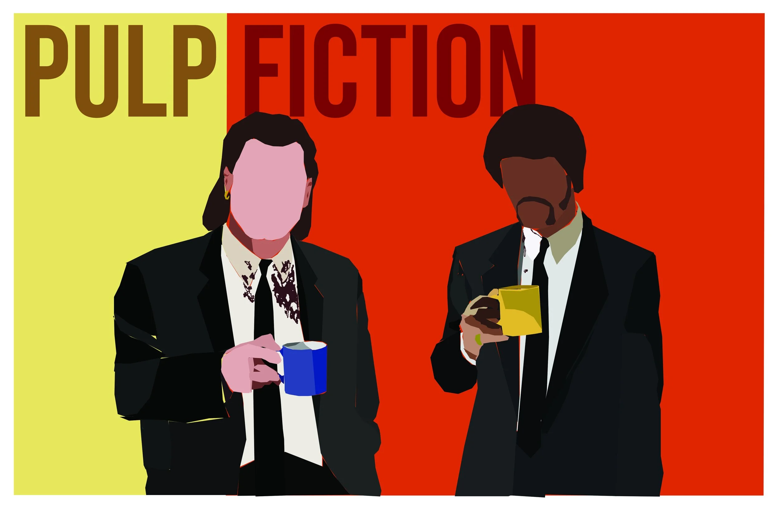
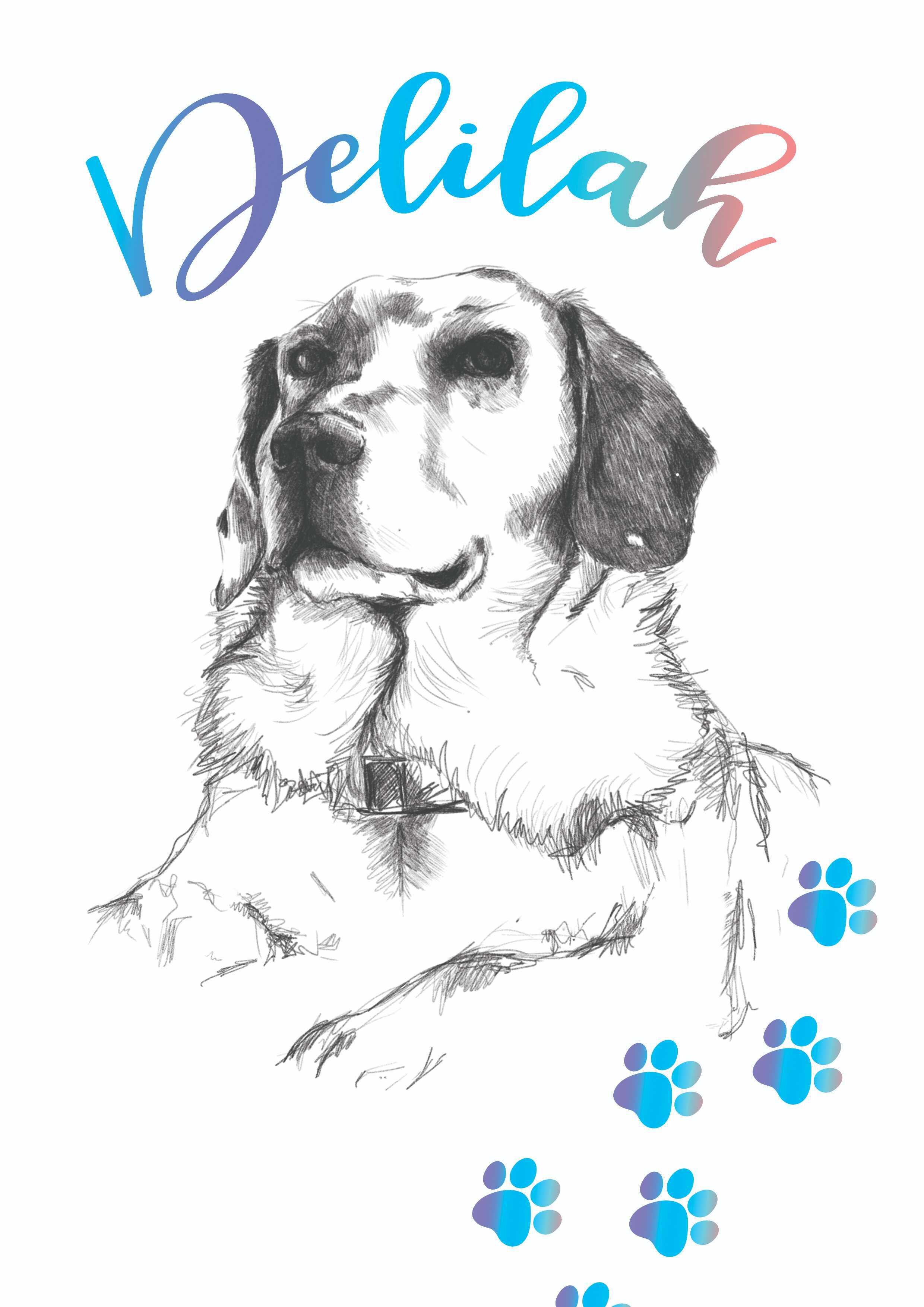
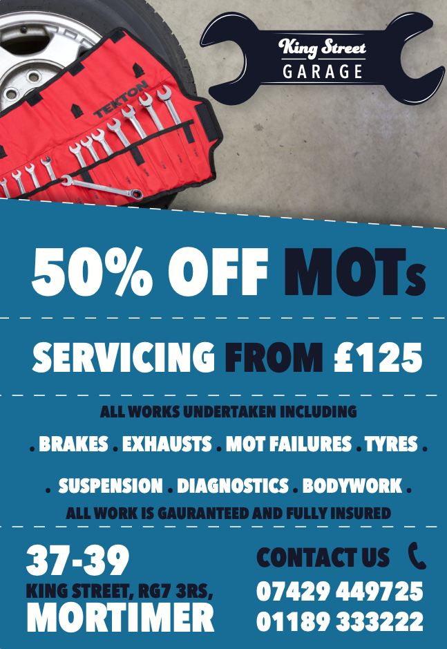
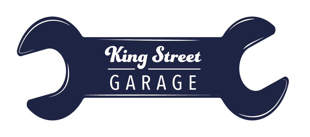
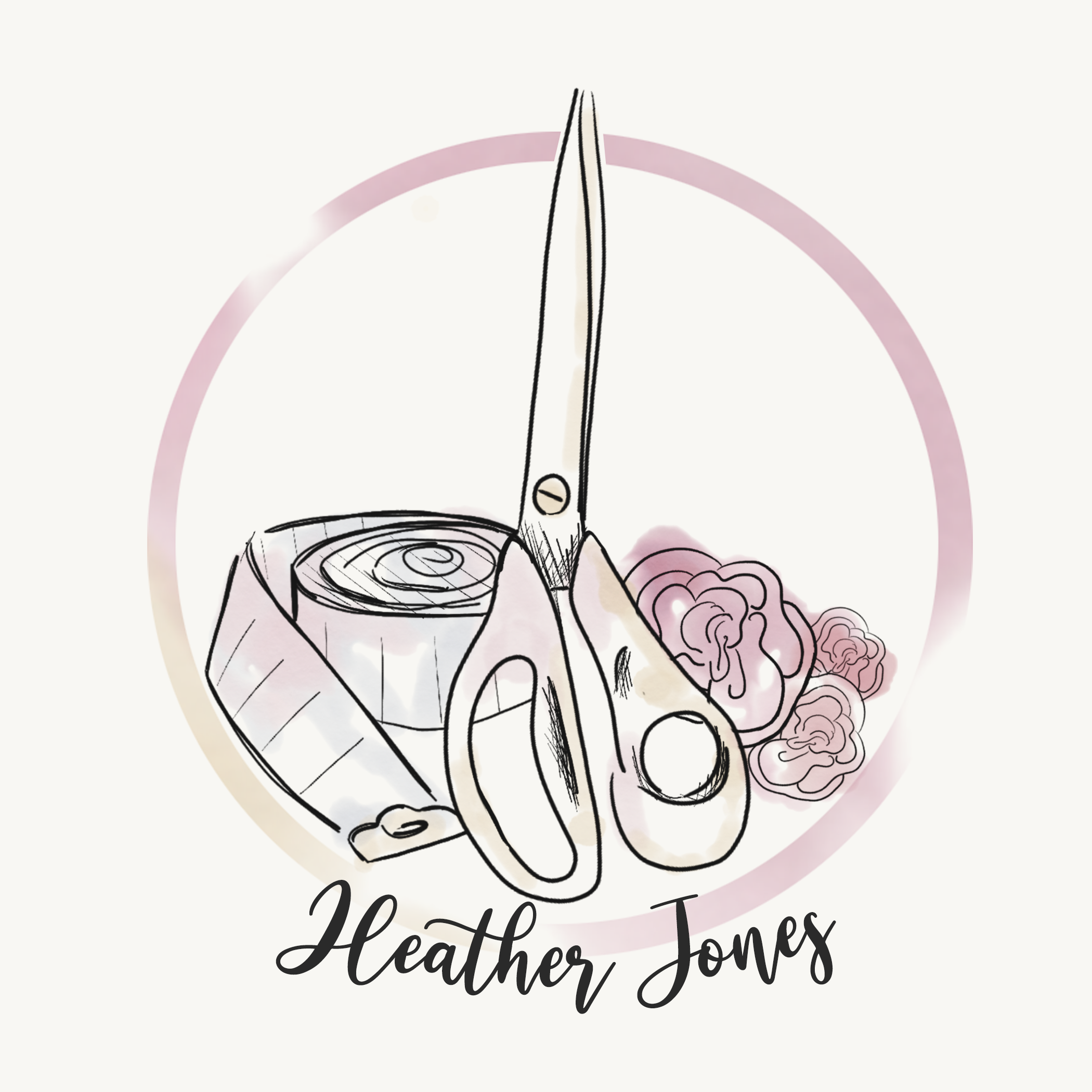
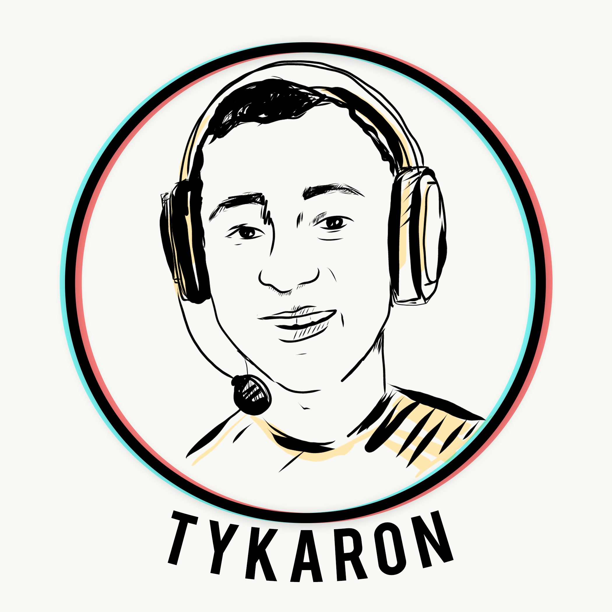
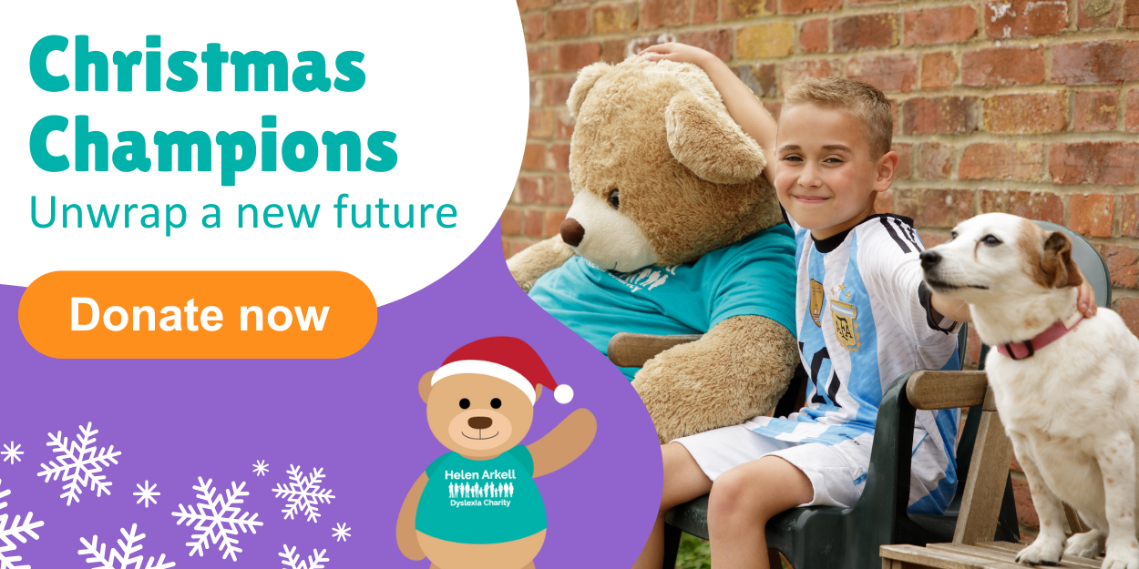
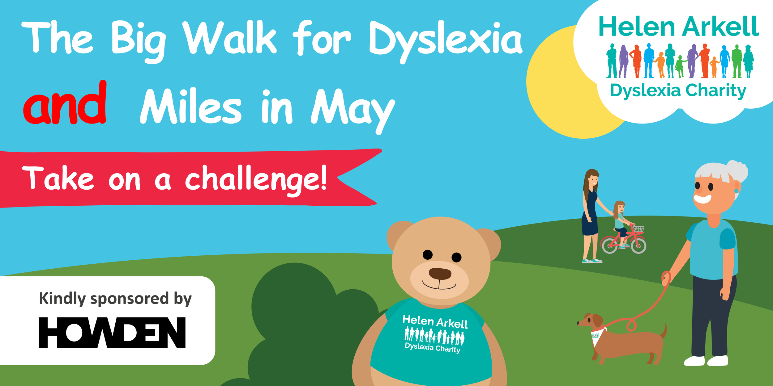
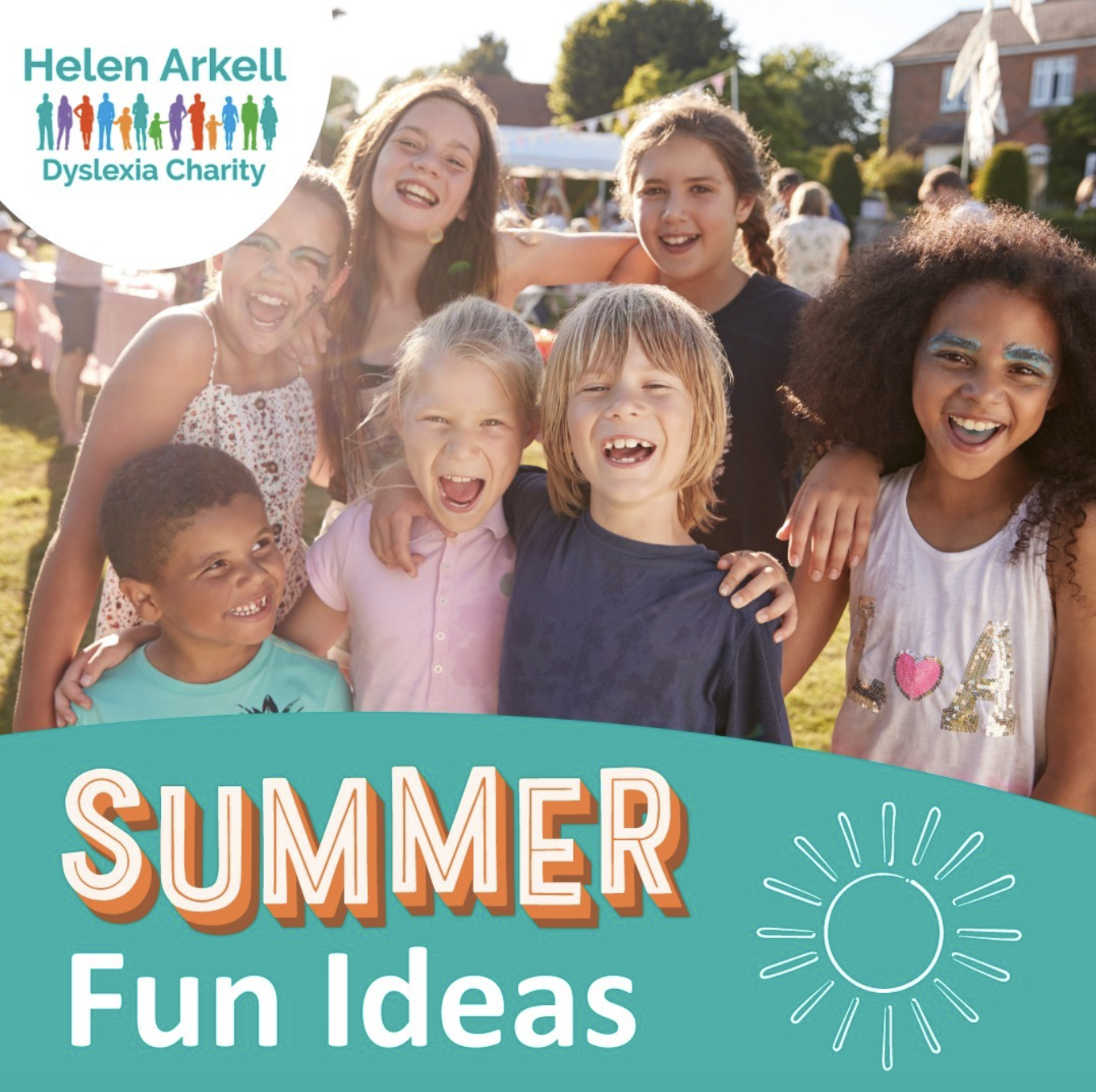
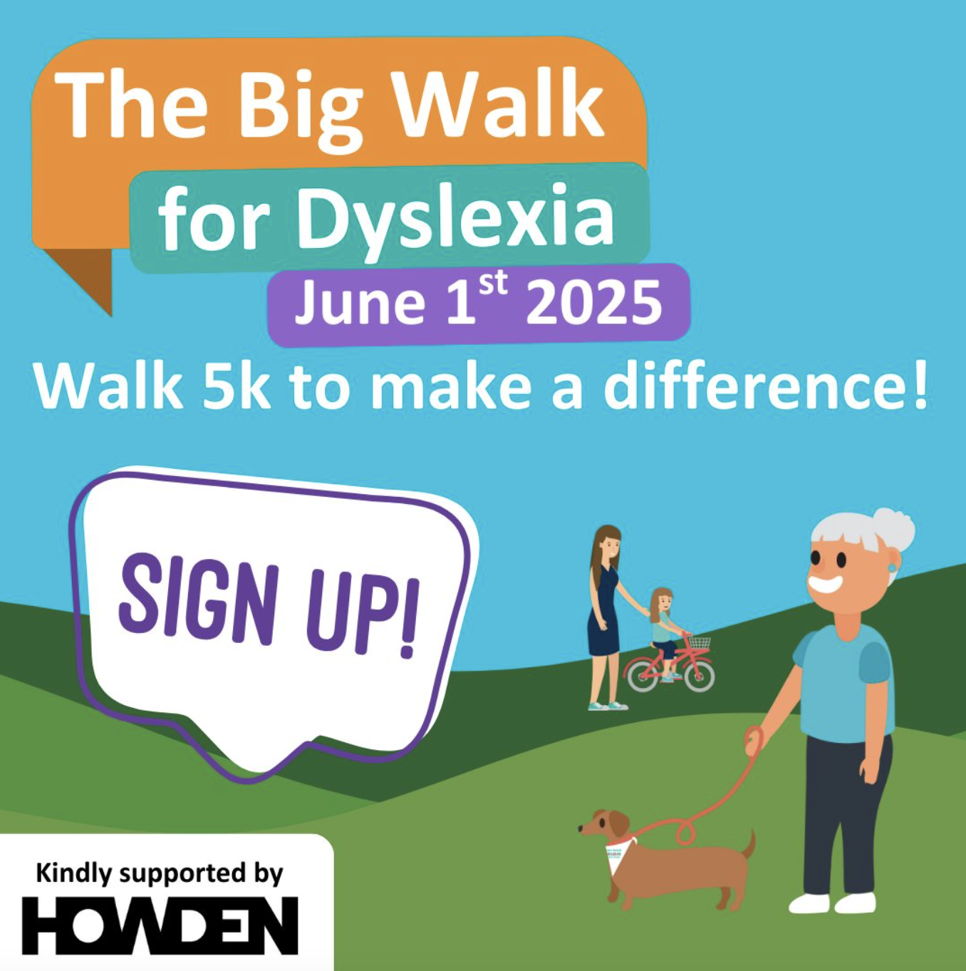
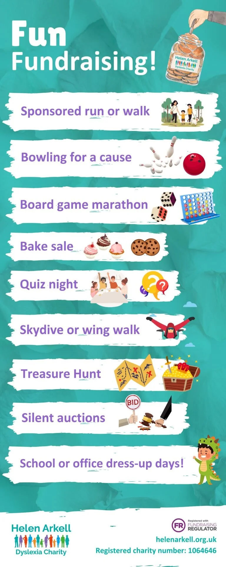
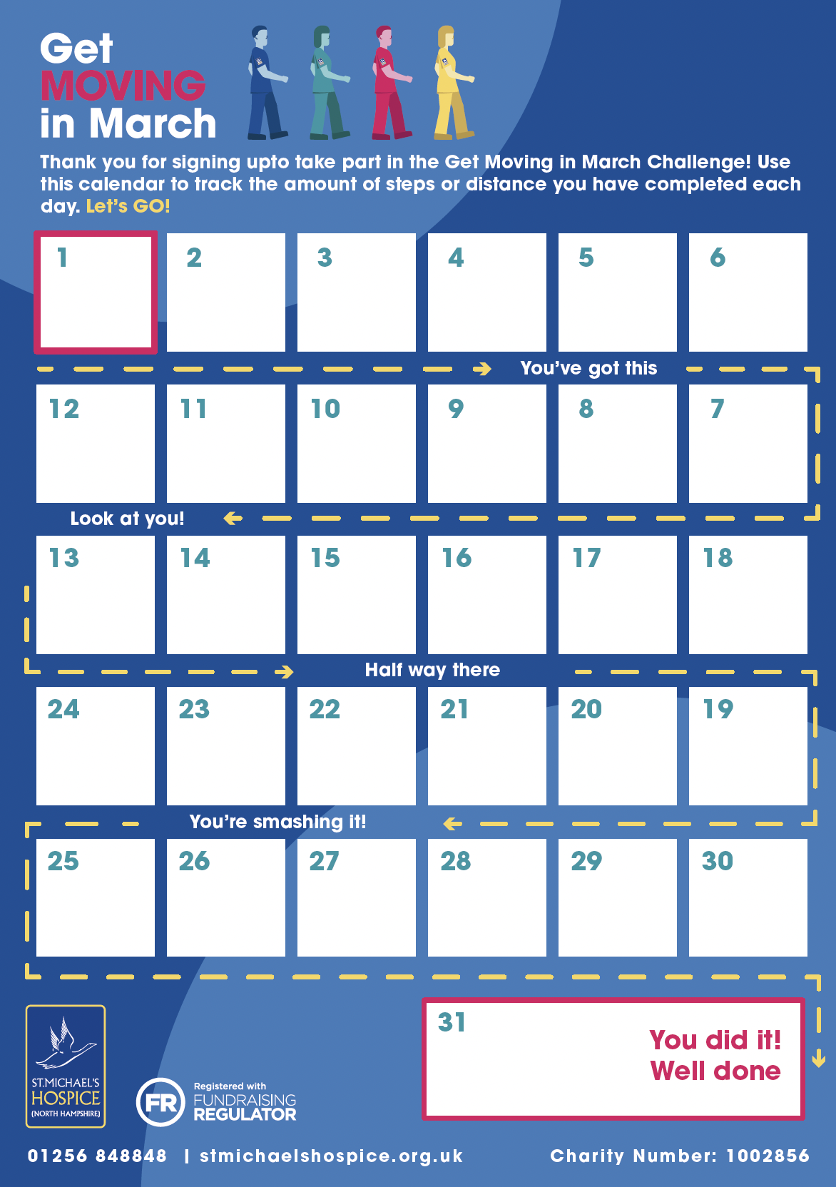
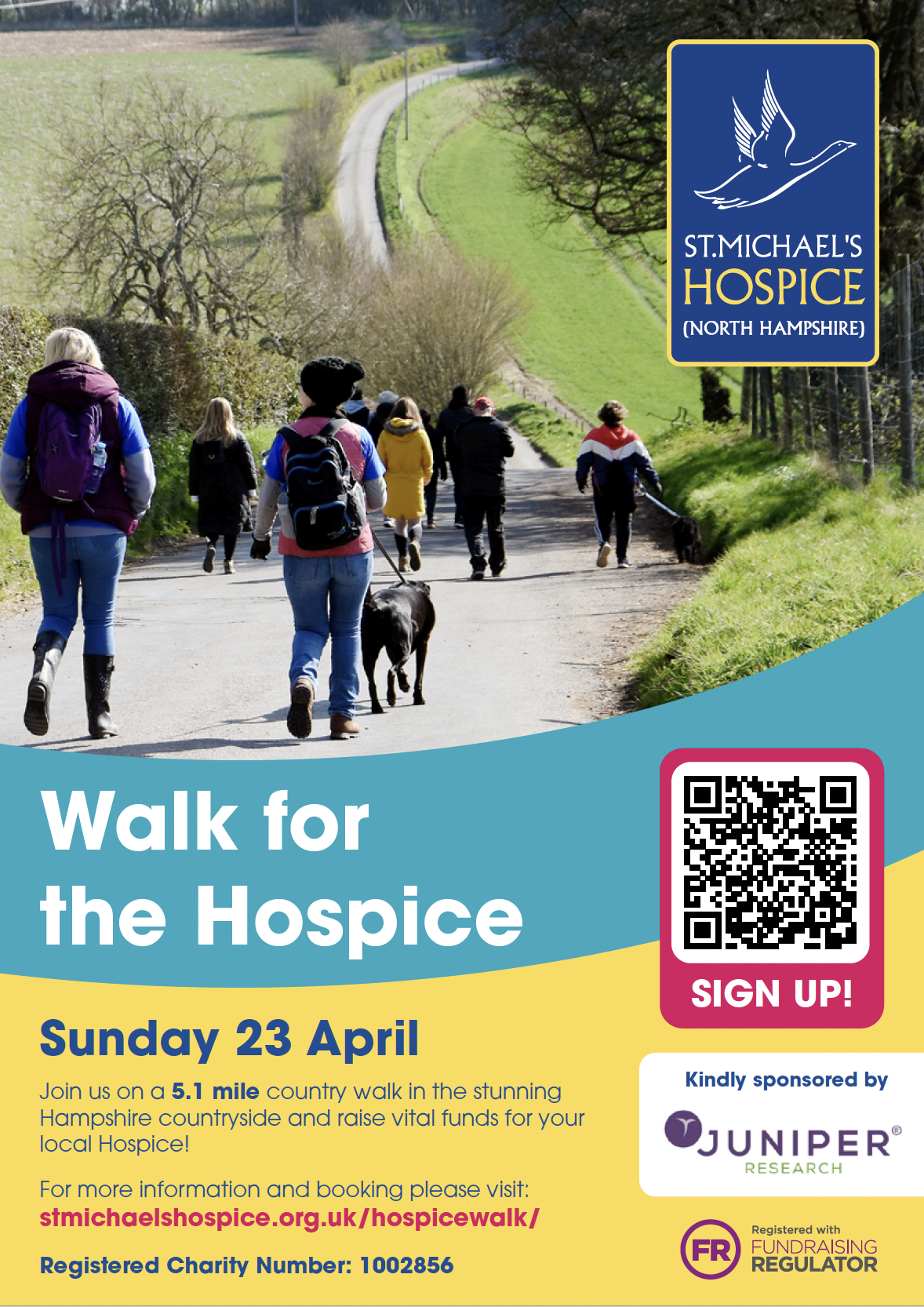
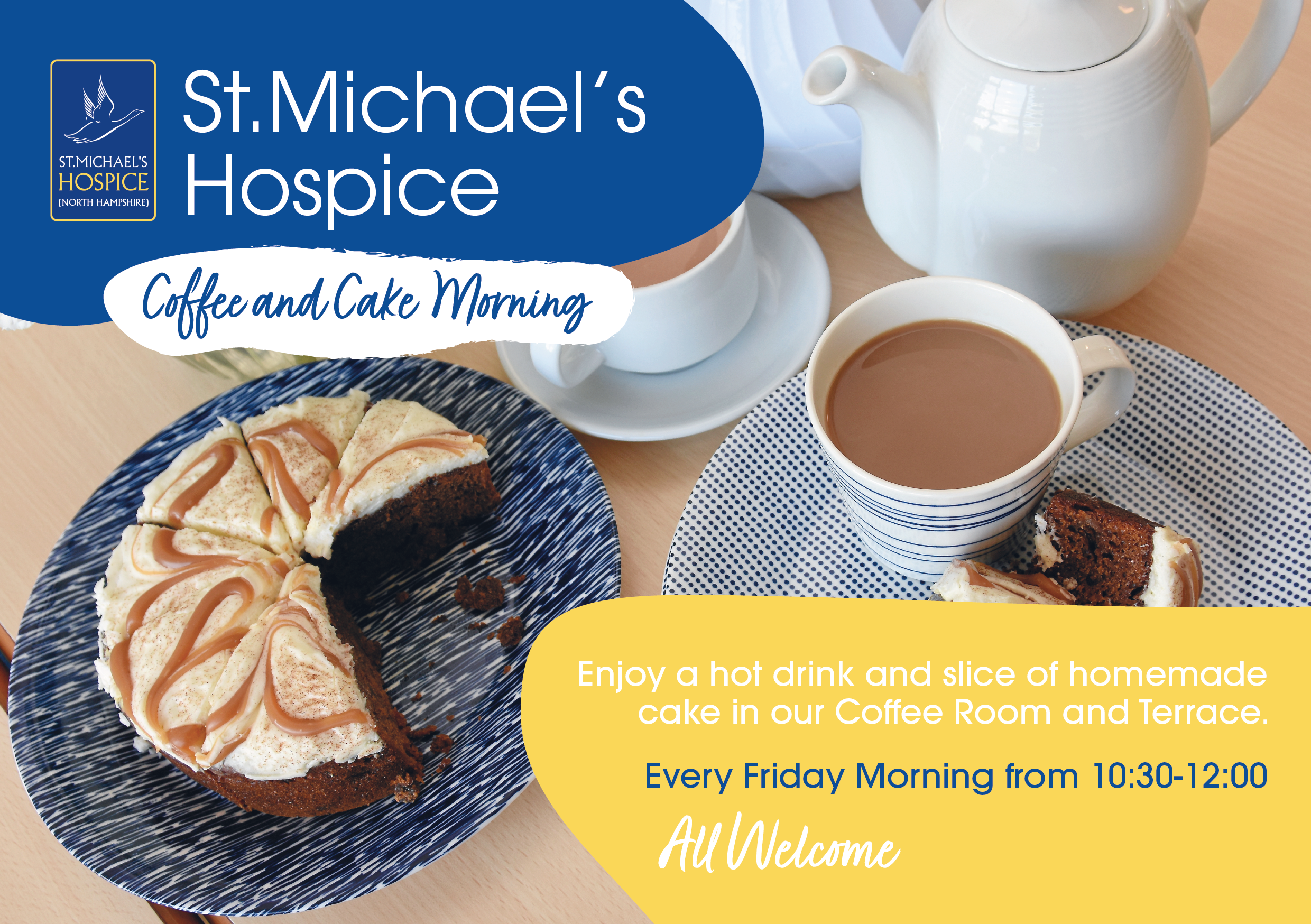
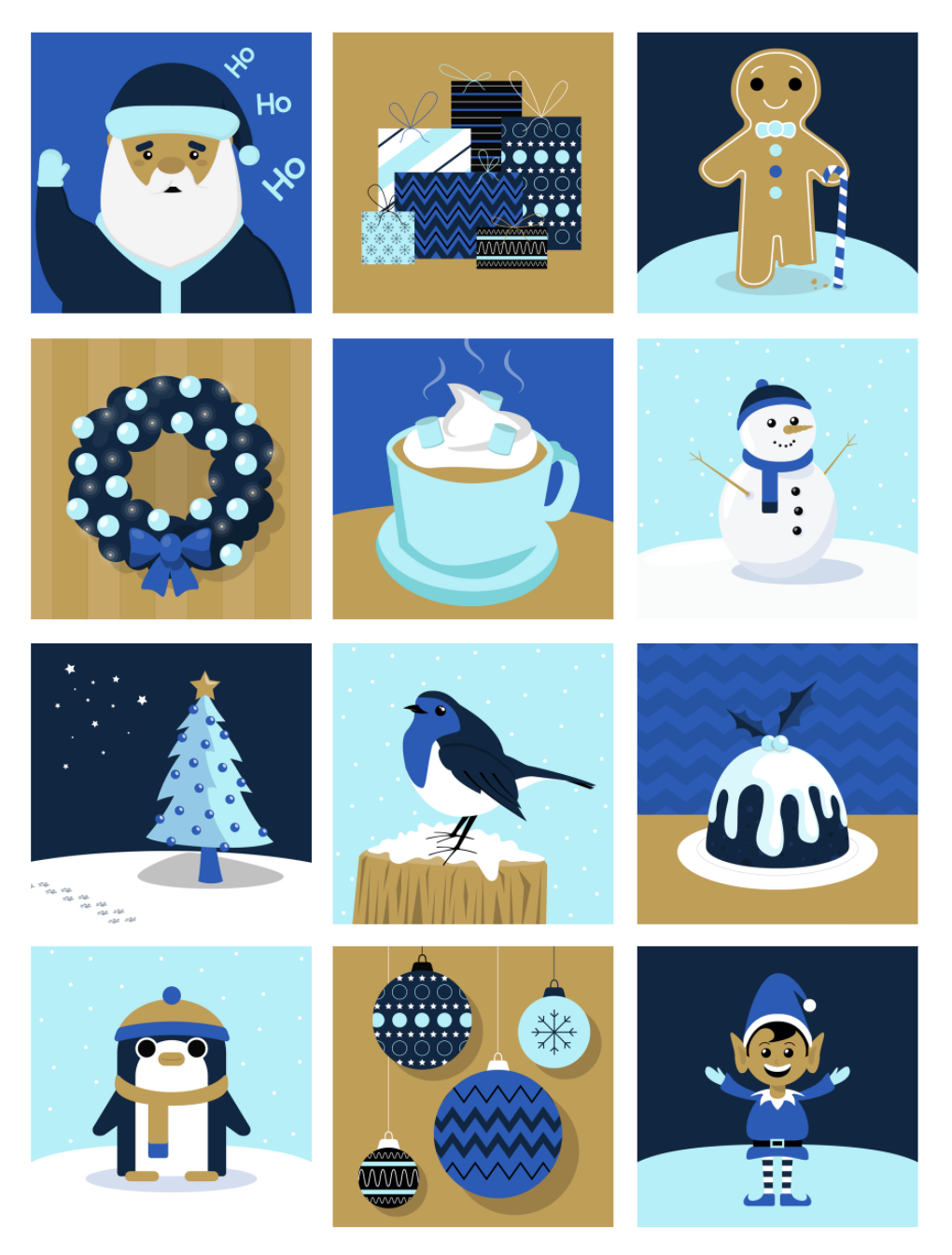
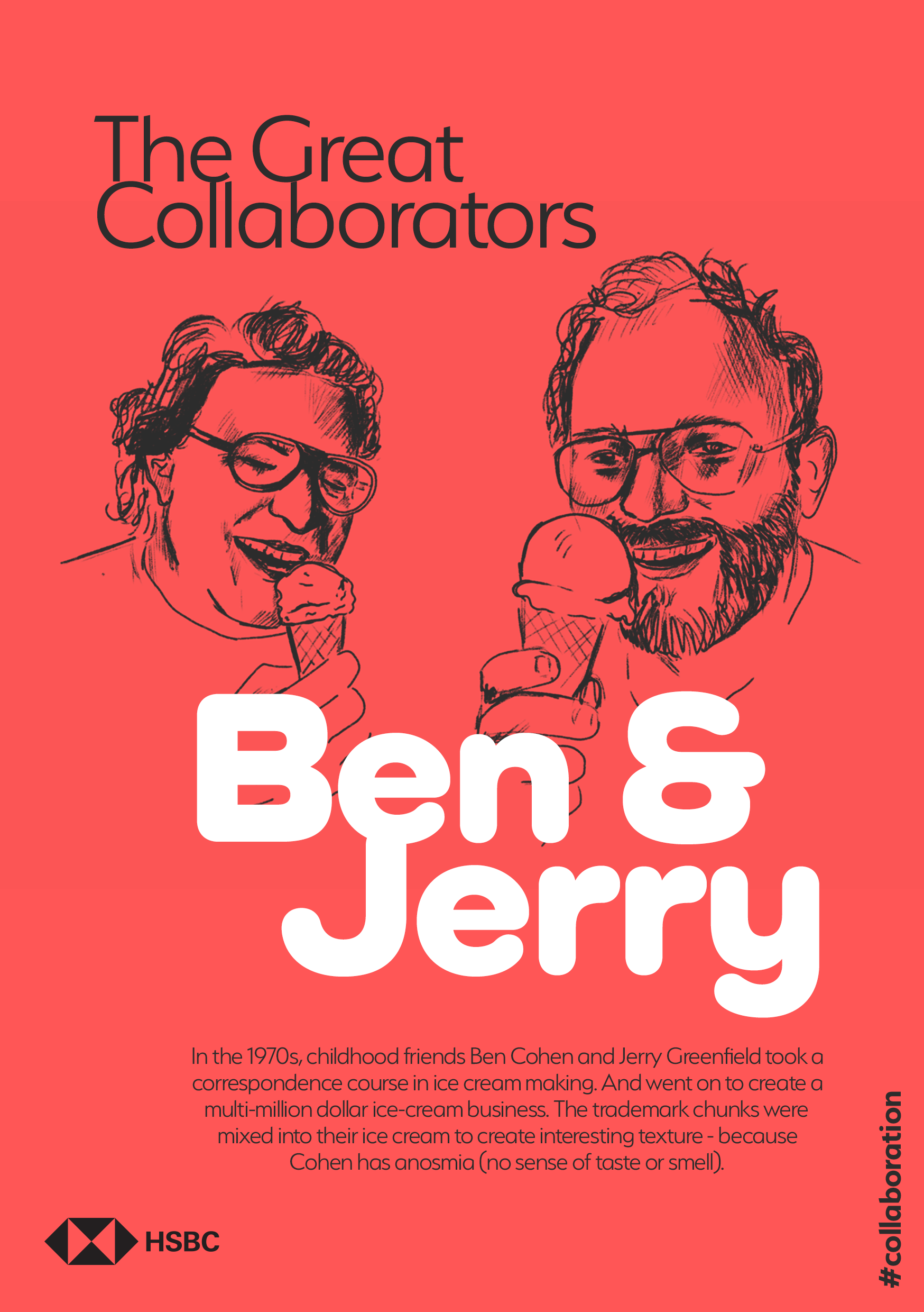
Here are some examples of logos I have been asked to design.
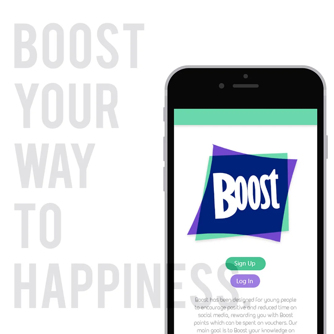
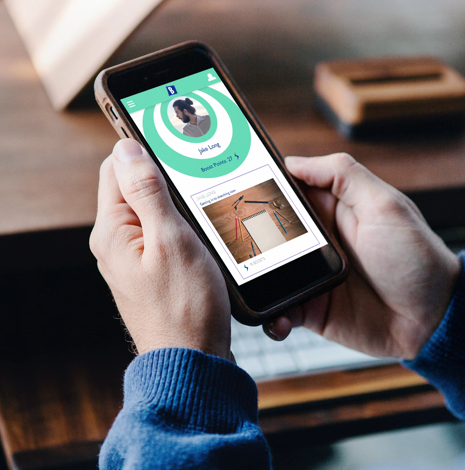
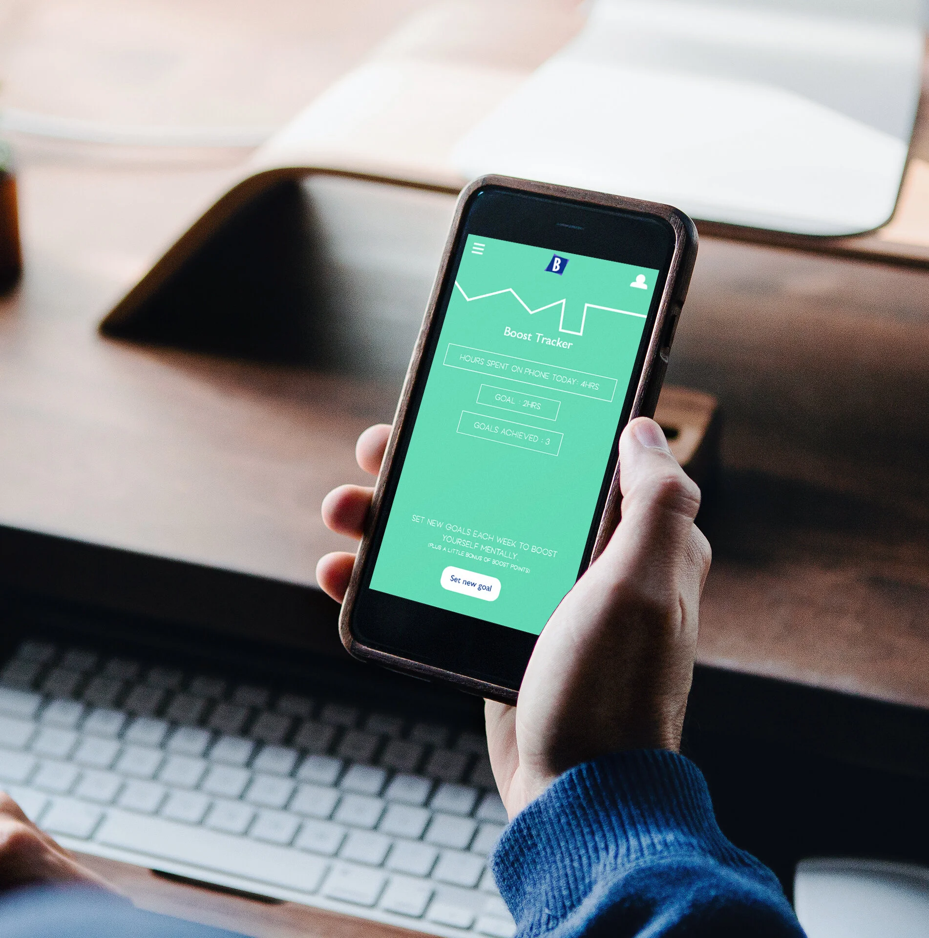
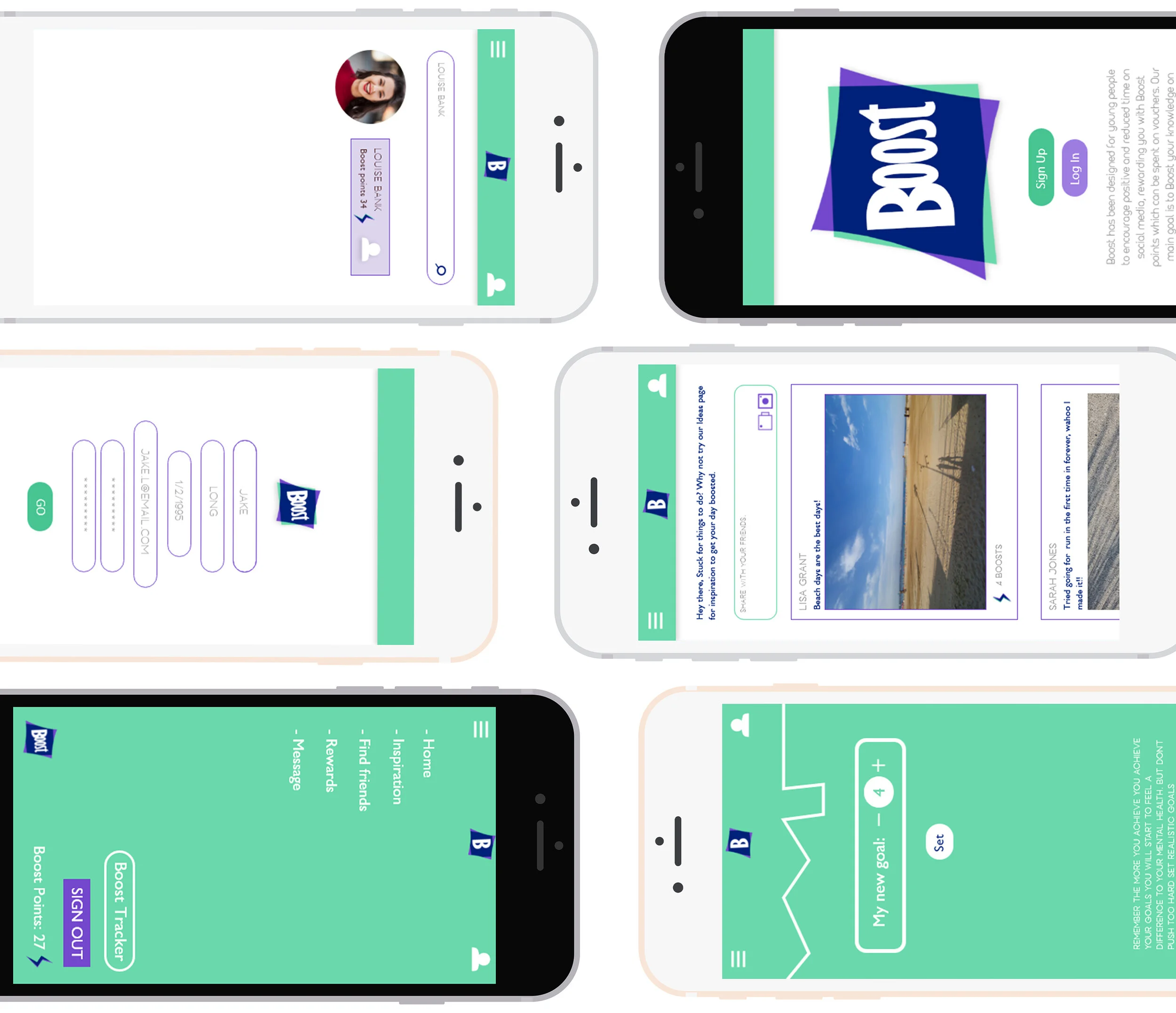
For my Final Major Project at University I set my self the task of designing a social media app called ‘Boost’. The target audience for ‘Boost’ is 14-25 years old who use social media to connect with others around them. I created ‘Boost’ with the final product becoming a safe and positive space for people to share hobbies and get inspired. Users can set goals to spend time off their phone through the built in tracker, when achieving these goals the users can achieve ‘Boost Points’ which can build up to unlocking rewards which could be used as discounts for shops and vouchers towards activities such as ‘Go Ape’. I wanted to include an inspiration page where users can look to get ideas of what to do when bored, and they can also post ideas for others to see as well. Users can share their daily activities on ‘Boost’ to also gain ‘Boost Points’ though a liking system on the home page. The app also has a ‘friend system’ where you can add friends to share experiences with them and even message them. You can create your own profile and keep track of your points and keep ‘Boosted’.
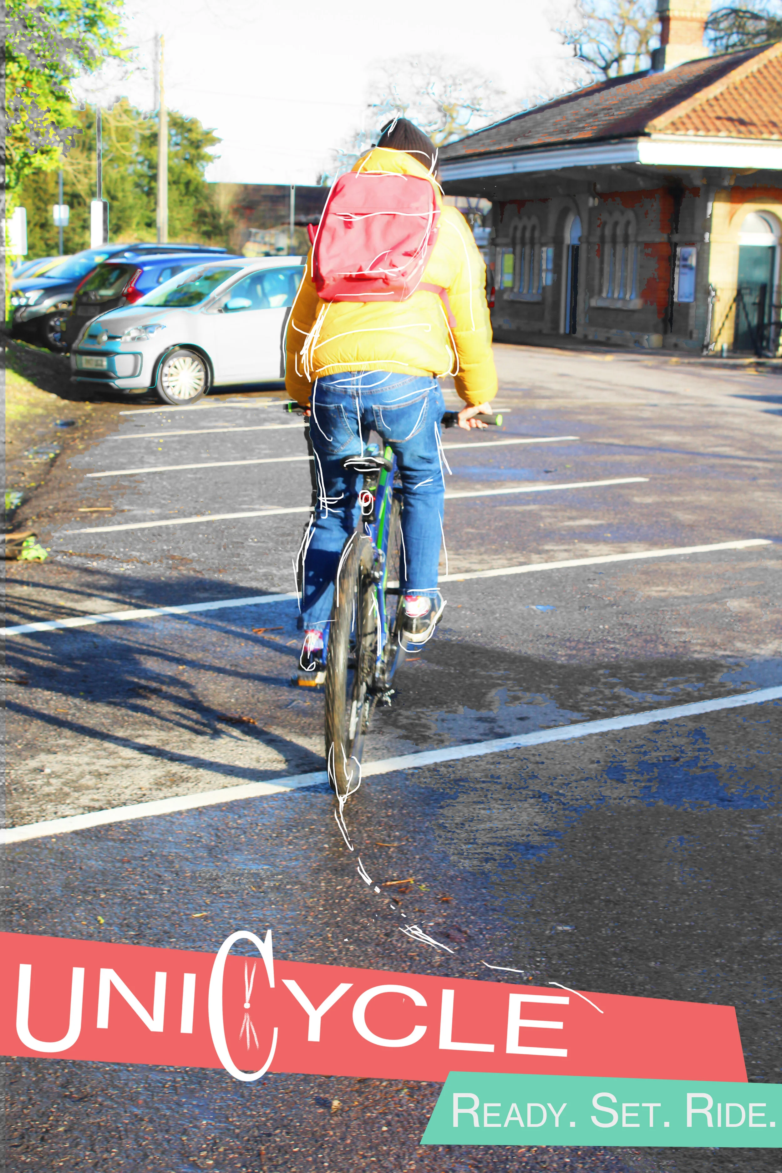
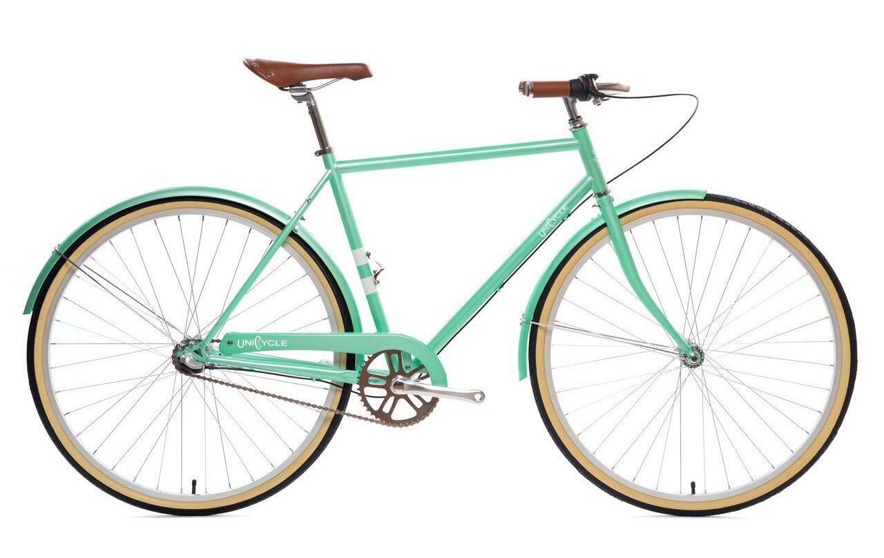
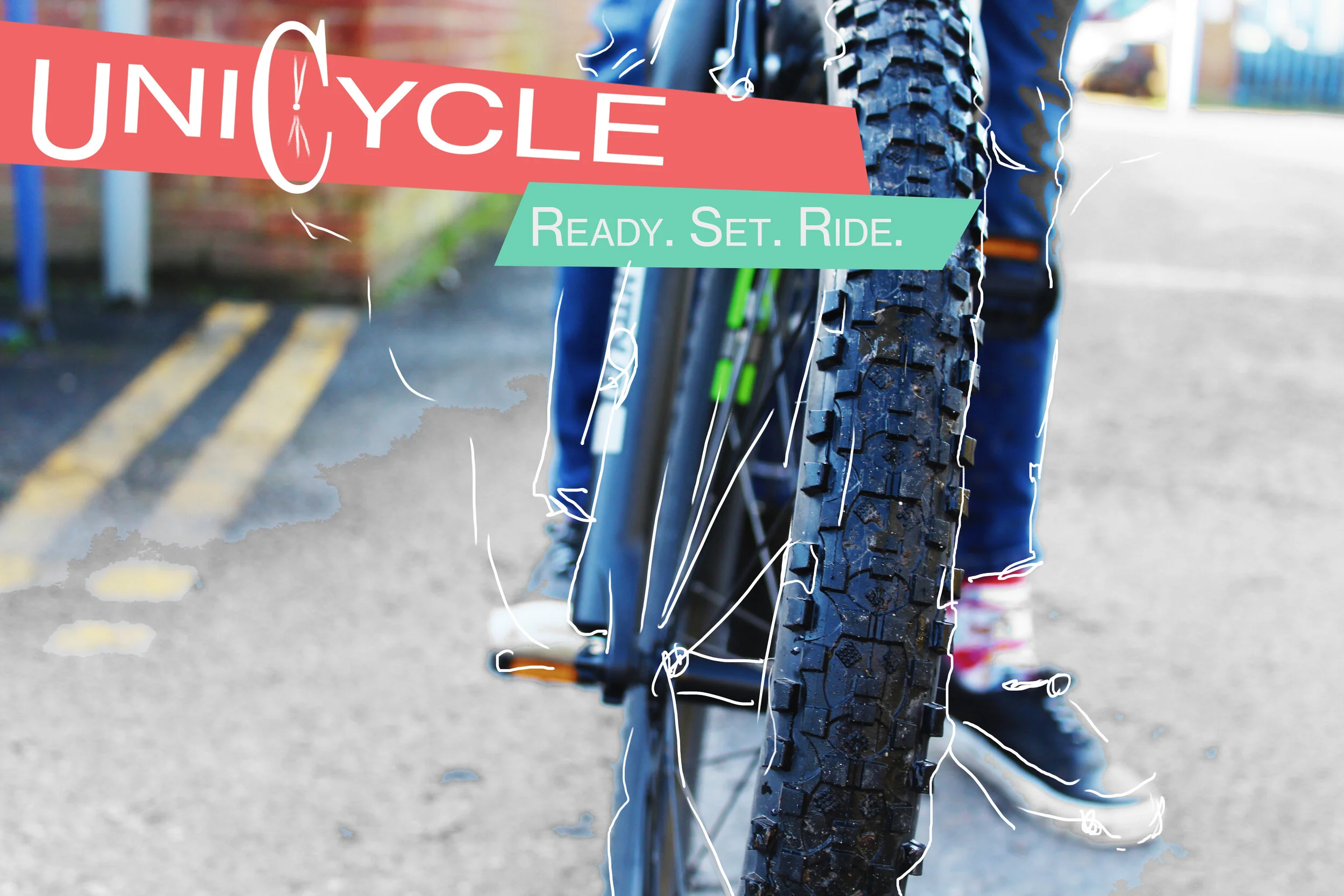
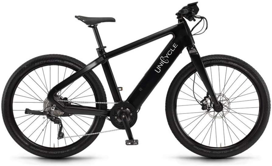
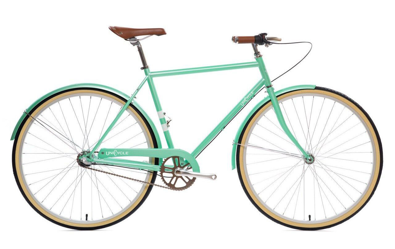
For this brief I created a bike hire Brand called ‘Unicycle’ This scheme would be based in Brighton for students. At all the campuses and Halls for Brighton university here would be a lock with ‘Unicycle’ bikes in which students can simply unlock via there phones and ride there bike to another campus or halls, and then pay once the bike is re-parked.
My chosen audience Students travelling to and from halls and campus, I wanted to offer an alternative to buses or walking by foot. My goal was to create an easy to use healthy way of getting around that is also cheap. I believe I achieved this though my idea and really enjoyed thinking about how I would promote and brand my scheme. My images I created would Ideally be used as posters around universities or alternatively on social media platforms.
Although My bike programme isn’t out of the ordinary that isn’t what the brief asked, I wanted to think about who would use bikes in a city. and the issues that may come with these. I am happy with my outcome I think the concept works well and It looks how I wanted it too.
However If I would go back I would think more about the way-finding and the App functionality of my idea. In conclusion I have learnt a lot from this project especially about how to brand an idea, and a lot about time management of a project and will carry this in to the future with me
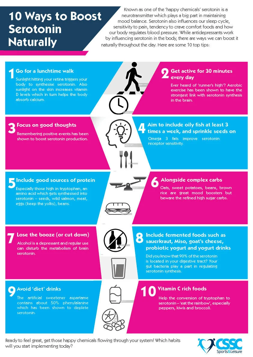
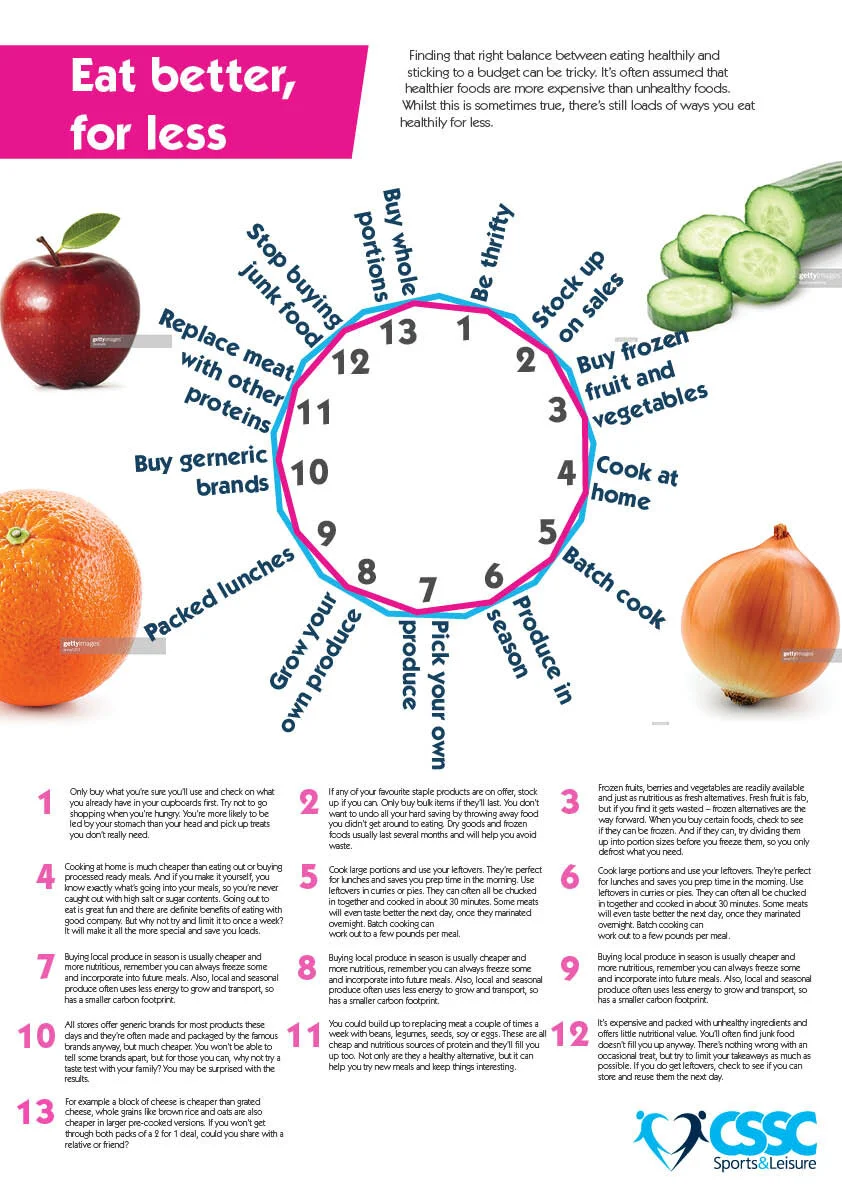
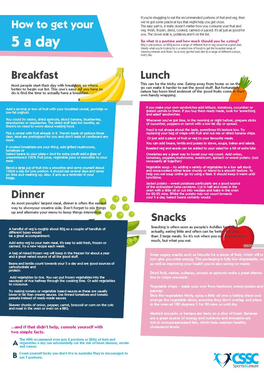
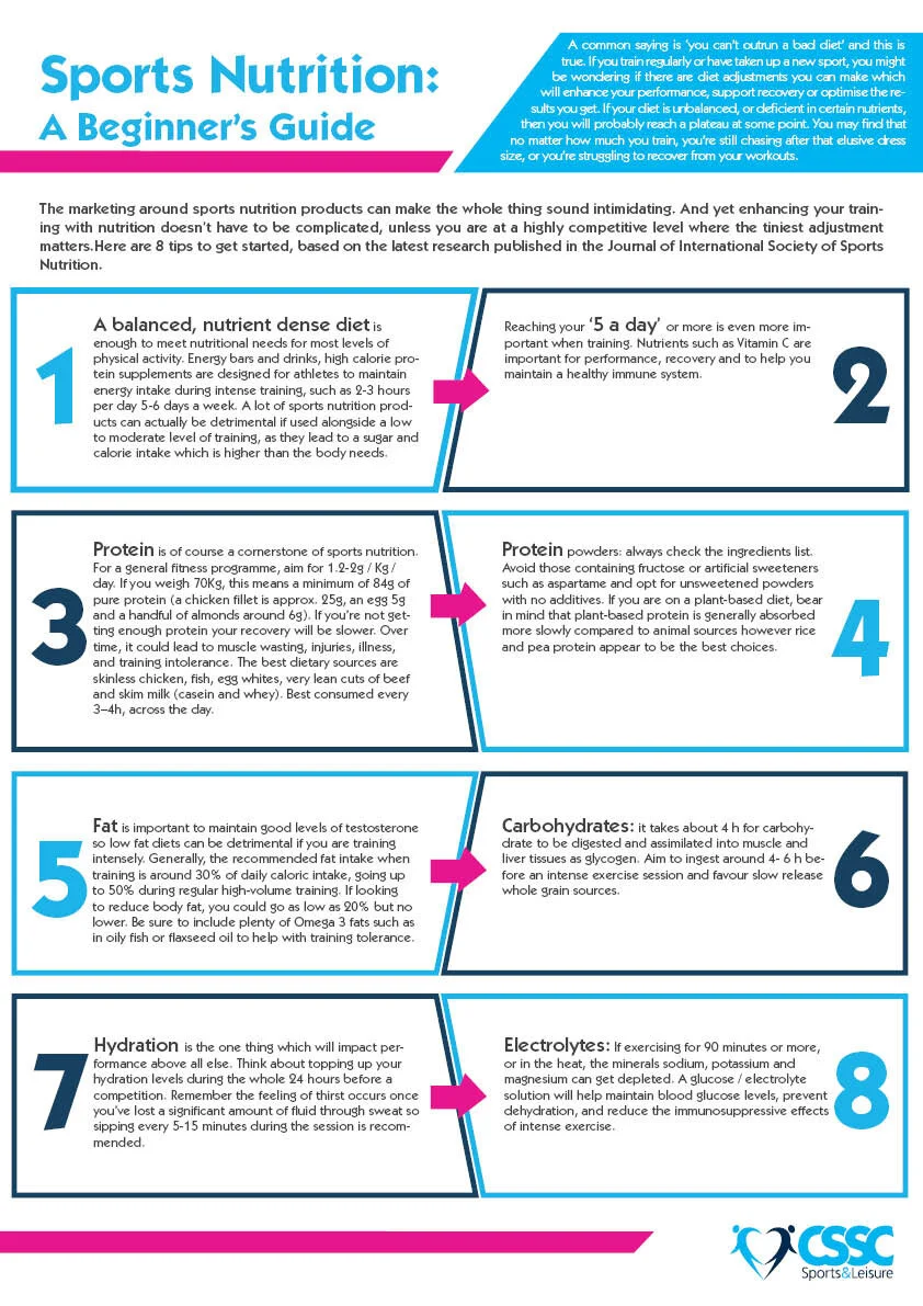
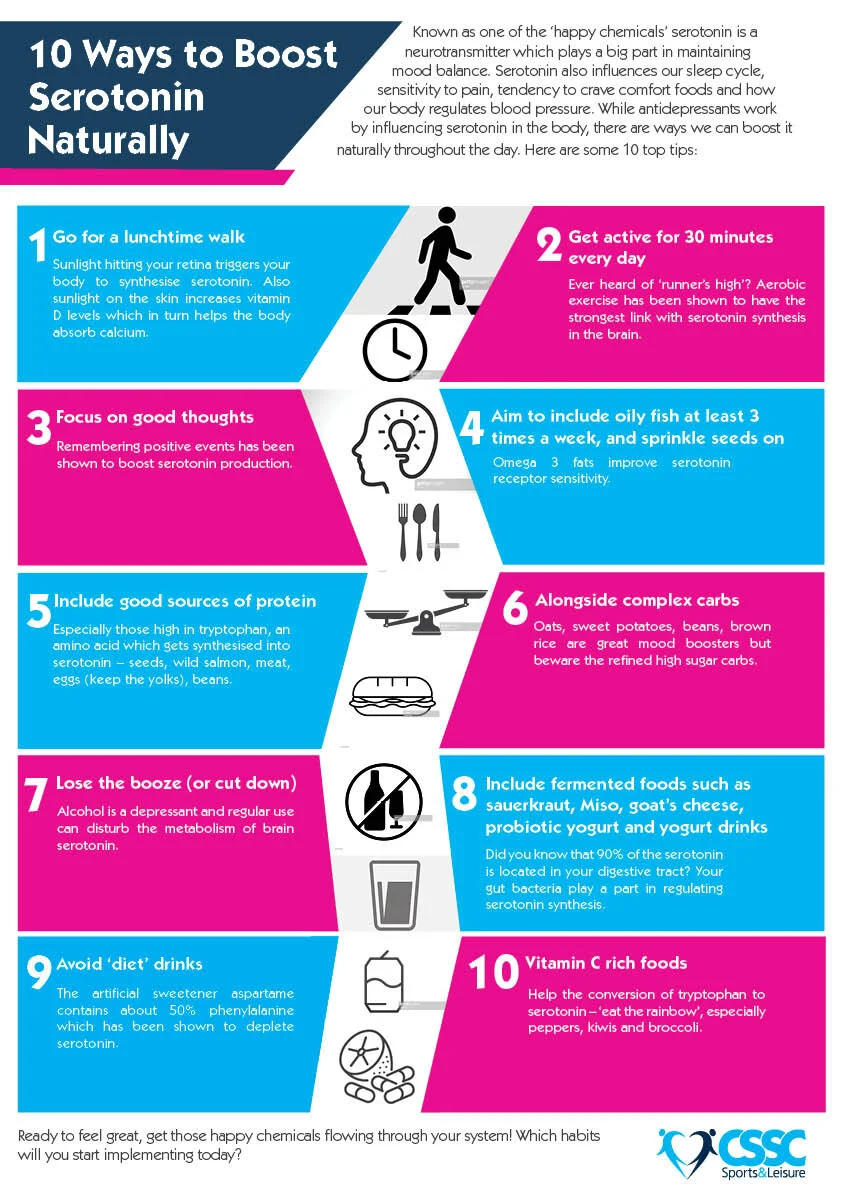
My first task whilst at my work placement for a month at CSSC sports and leisure was to redesign some posters that would be used to give staff and members information on how to stay healthy and active. I did a total of 4 posters and kept the brand colours and fonts consistent throughout so it was clear they belonged to CSSC and they were all part of a set.
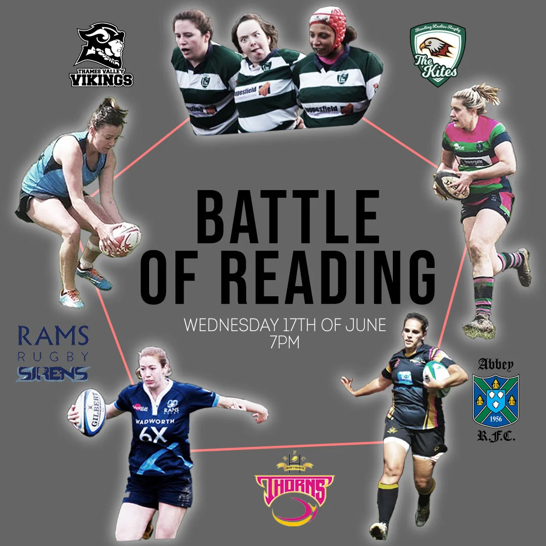
This is an image was to a brief I was commissioned for an event called “Battle of Reading” where 5 ladies rugby teams competed against each other.
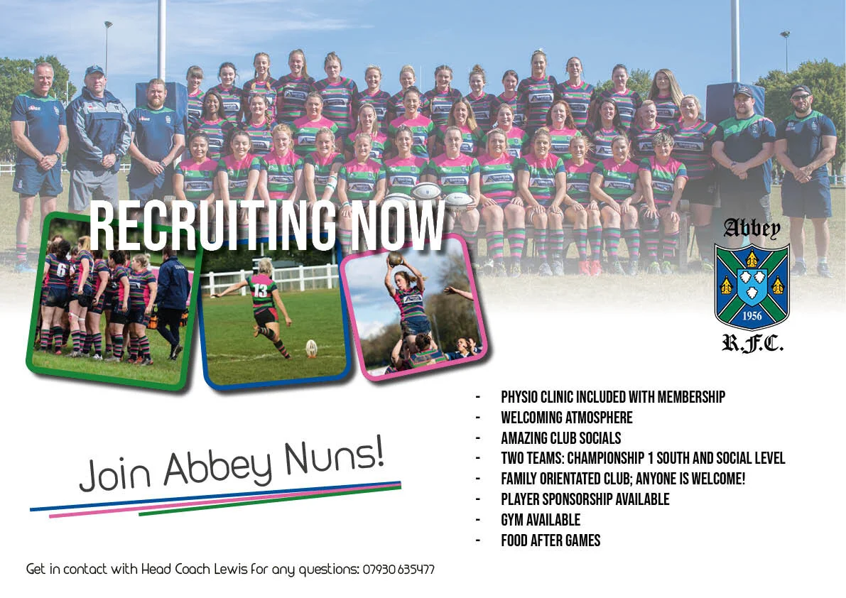
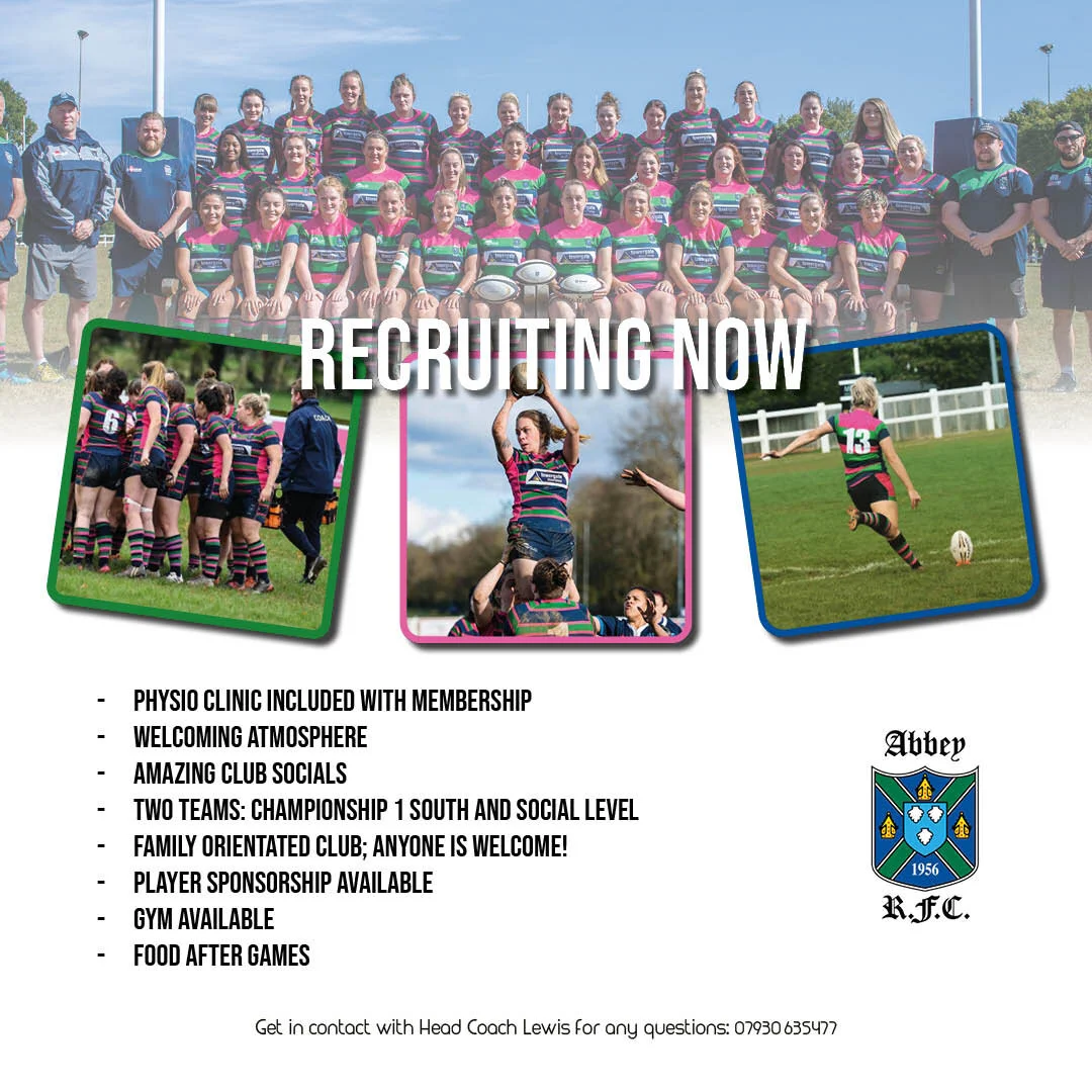
These are some Images I was asked to created for the Rugby team ‘Abbey Ladies RFC’ They asked me to crated a recruitment poster for new players with some information which could be posted on Instagram and Facebook to draw potential new players in. The first image is the Instagram layout and the last is the Facebook layout.
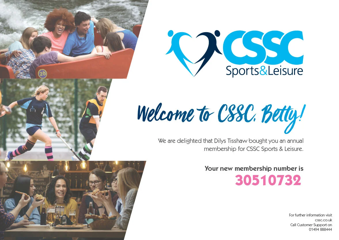
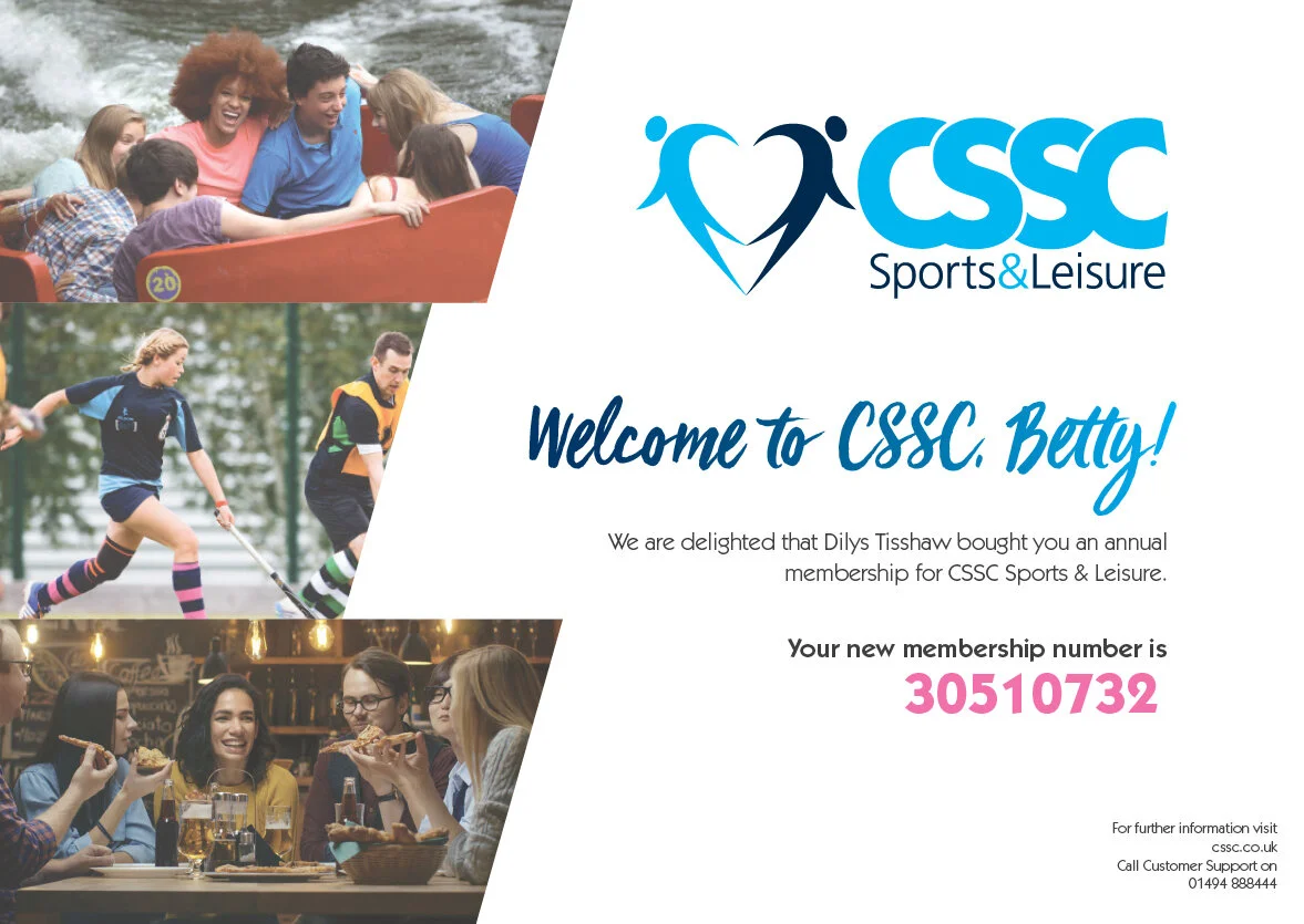
During my work experience at CSSC sports and leisure i was set with the task of redesigning their membership certificates. Here is my design, which was taken on to be used as their new member certificate when a new member joins.
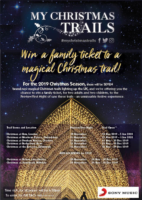
At my time spent at CSSC I was tasked with creating an advert for a completion that would be ran during the Christmas run up, this competition was to win a family pass to a Christmas trail light show across England. I was asked to use the given images.
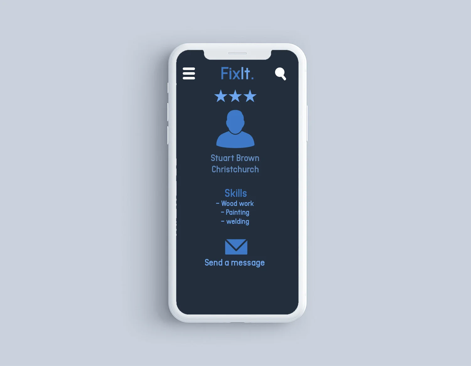
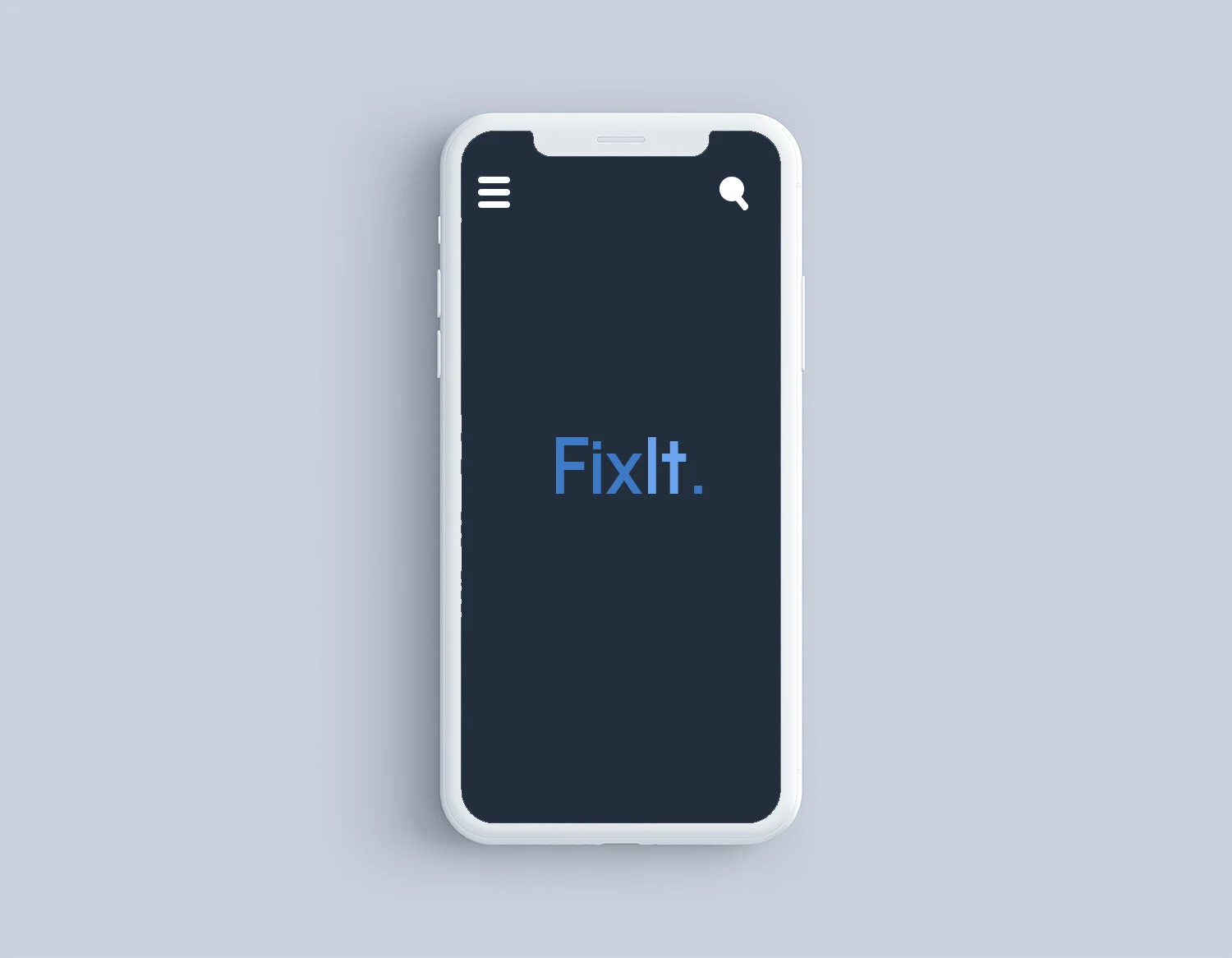
I designed this app to be used as a tool for young people of the ages 18-25, who are perhaps starting university, or a new job that requires then to move somewhere new where they do not know many people. I wanted to help these people connect to in order to make friends and learn skills from one another to repair and reuse items that they would otherwise throw away or leave in cupboard to gather dust.
I chose this problem to fight as after doing some extensive research I found in this world of today the amount of items we with break then throw and replace are at alarming rates, and people need to be shown and work together to teach and change how we can stop this huge waste dilemma.
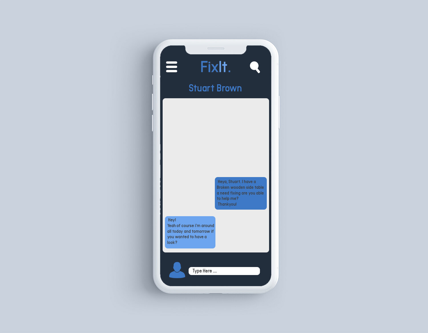
I wanted this app to have a social media aspect to it allowing it to be easy to communicate with local people who have skills easily.
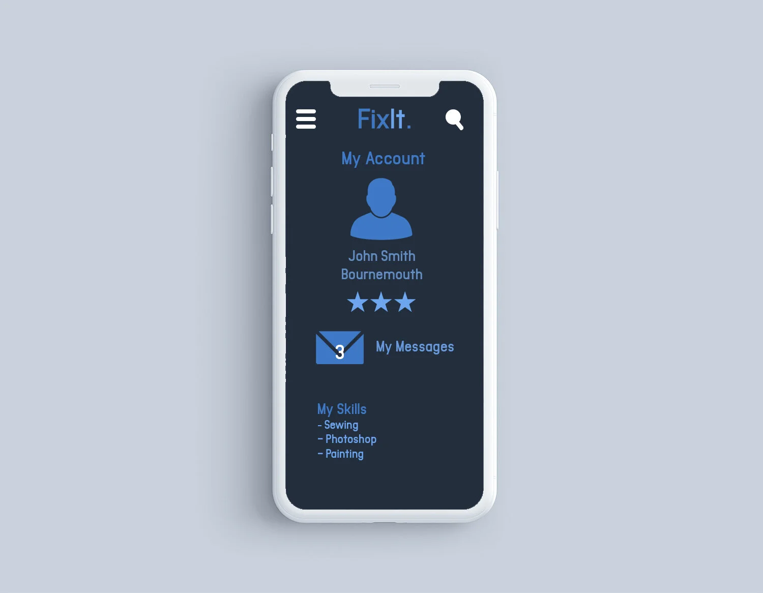
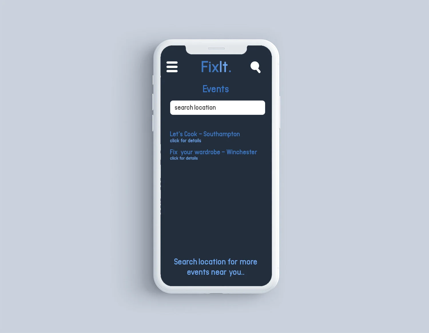
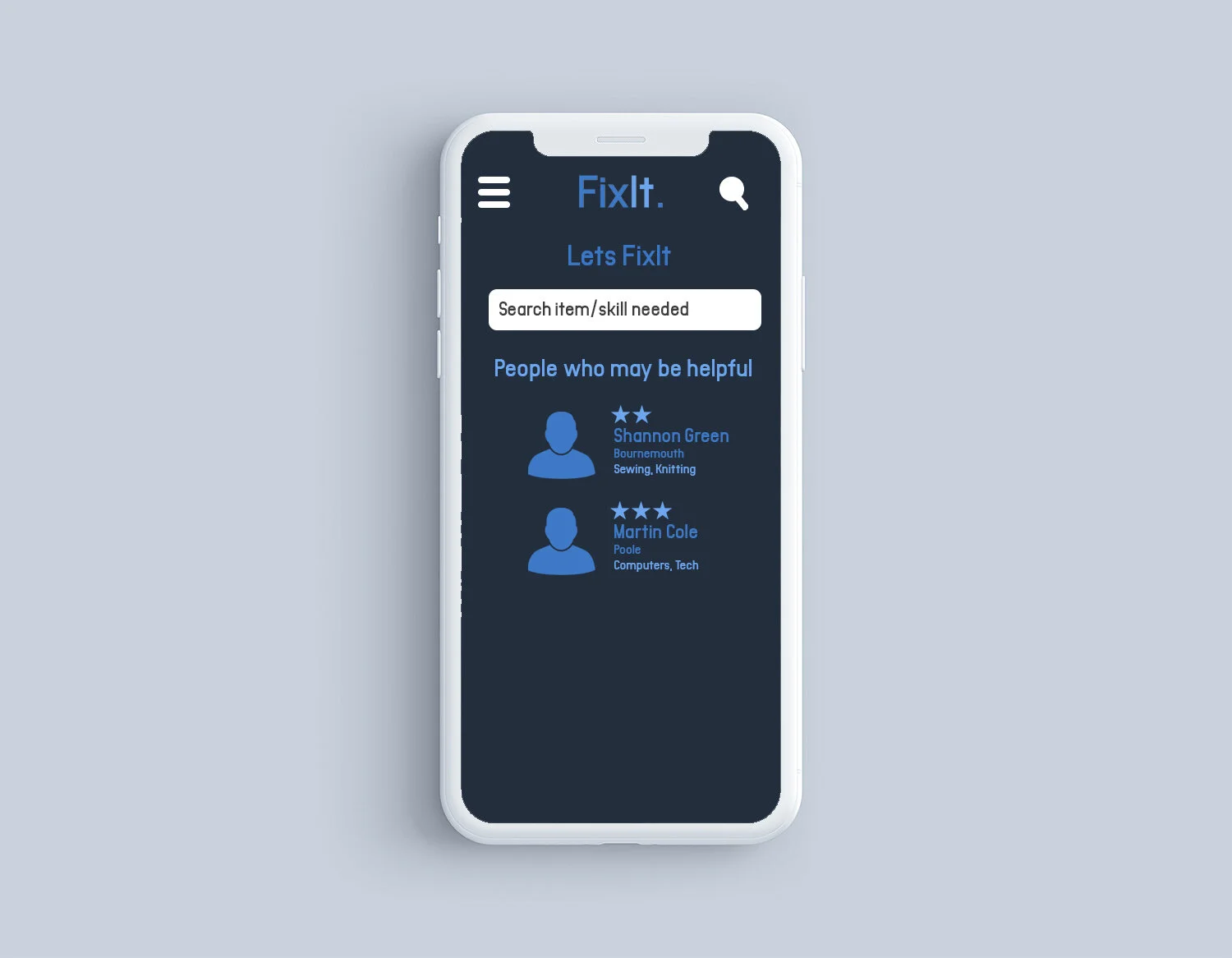
Upon opening ‘FixIt.’ For the first time you will be asked to sign up with your email address, from here you will create your account where you state your location so local people can get in-touch, and your skill set. You can use this app to not only search for people in your area who have a skill you need, but also for local events in your area ran by volunteers like you who use the app, looking to share skills and meet new people.
If communicating with people you will be asked to give a rating out of 3 stars on how helpful/reliable this person has been, this measurement is put in place to make sure people have an idea of who they are talking to. As far as safeguarding goes, I would envision this app being over seen by a group of people who make sure that events are safe to attend and who run safety checks. This would perhaps be volunteers or people who officially have a job title of overseeing the app.
This animation was an outcome for a unit called ‘Narrative, Sequence & Interaction’ at University where I was set the task to create a 20 sec- 2-minute sequence in pairs or alone, I chose to work in a pair, because I had little experience in animation and we both felt we could tackle this project together more effectively. This sequence would need to consider sound as a creative tool to enhance the images we create. We would need to be cautious of copyright issues when using sound. When making the sequence I would need to consider the target audience and where would be best to show our outcome to them, whether that be online, TV or digital screens shown in places like stations.
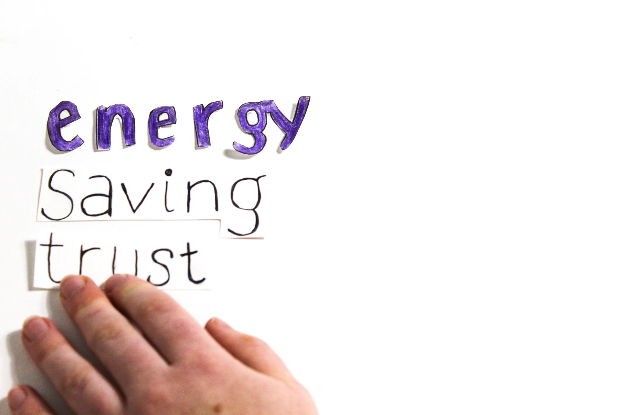
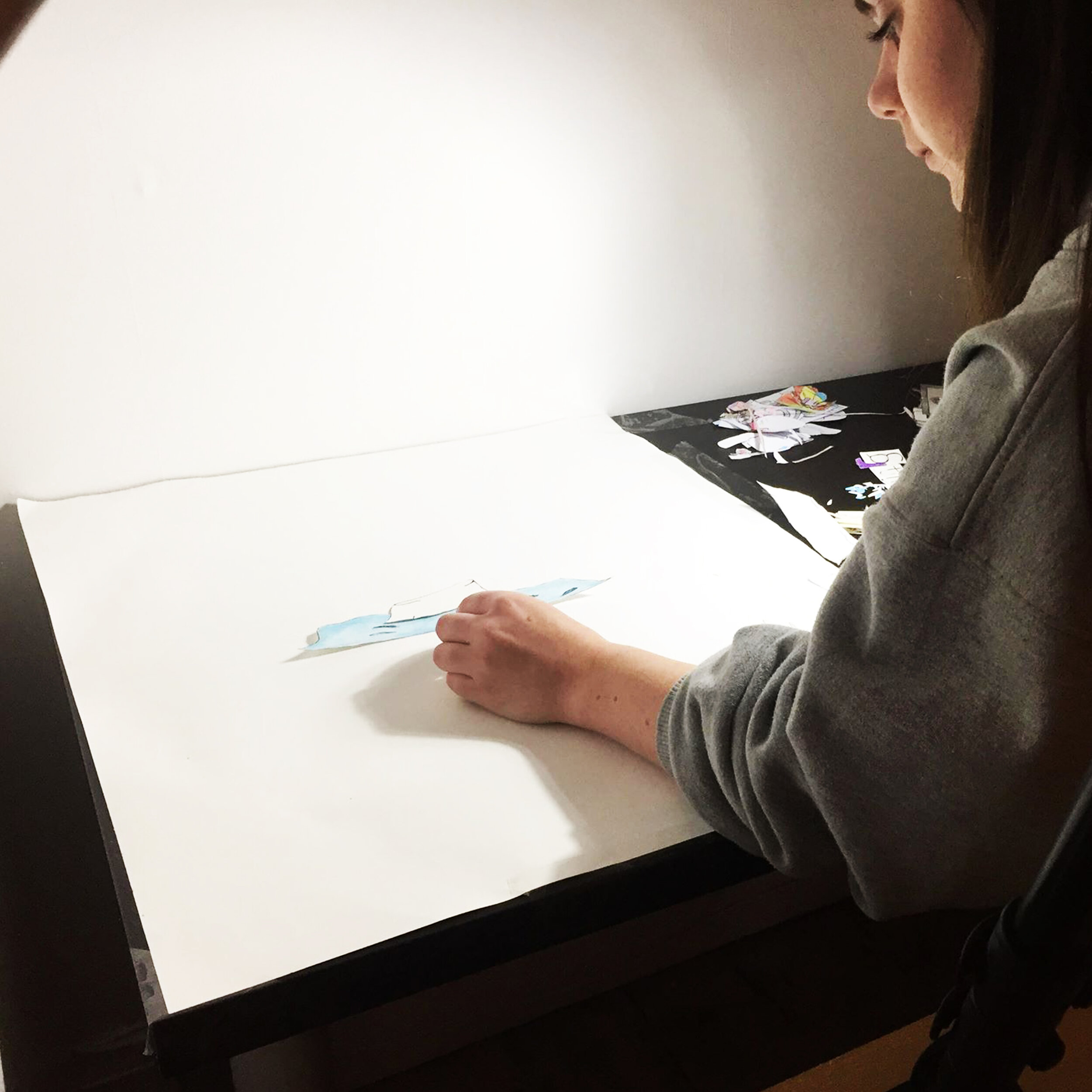
The aim for these short videos were to show young people of 18-24 how to save energy and there for money and reduce carbon emissions. These videos are part of a campaign for the Energy Saving Trust, to make younger people more aware of them so that EST can help them. We created this stop motion by drawing all the images by hand. Then recording the hand moving the objects , I captured each time they moved. We also added a voice that we scripted as a pair and luckily had a friend that was willing to voice this, to add on during editing, we also found some royalty free sound affects online to tie the whole stop motion together.
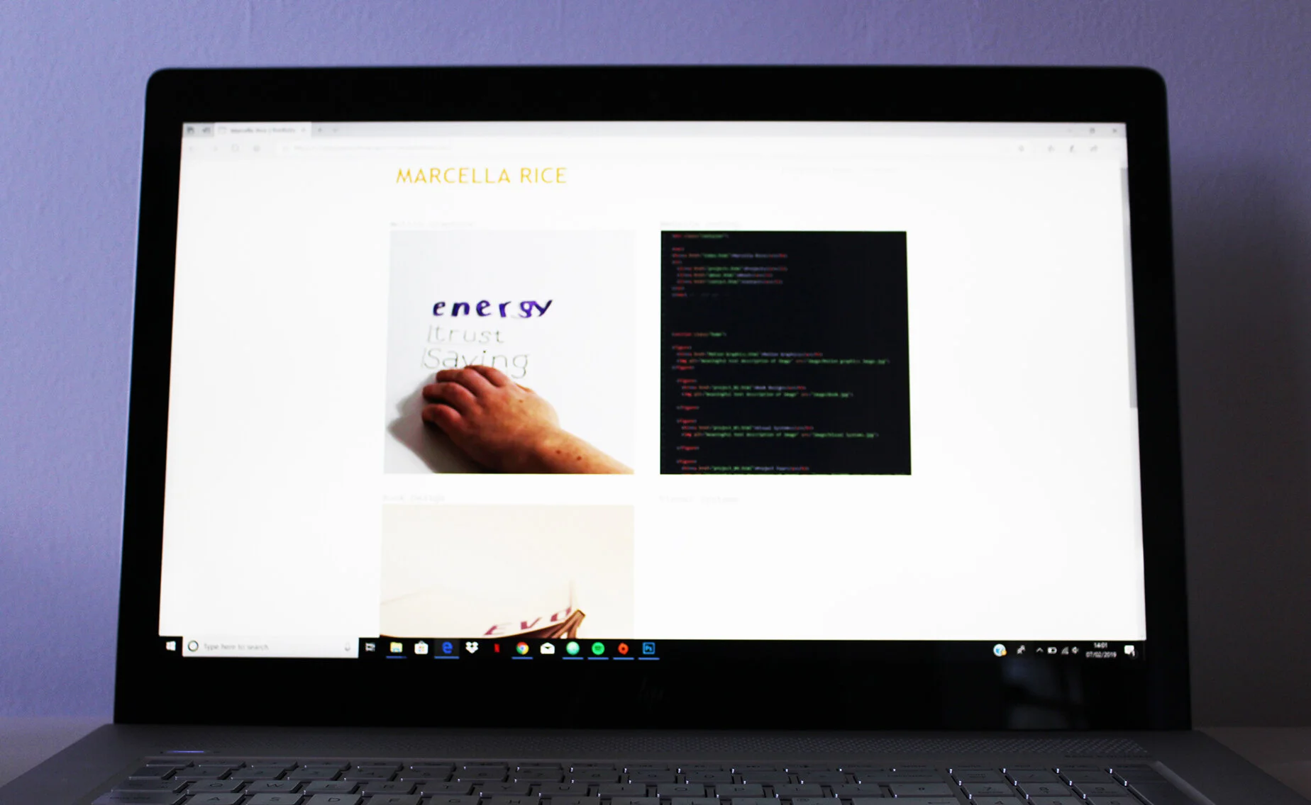
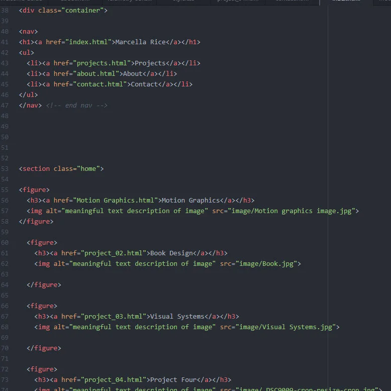
For this brief I was set the task of coding a working website portfolio to showcase at least 6 projects including the Motion Graphics project.
After completing this project, I am very happy to have created my own coded Website Portfolio, I found the experience a difficult but very rewarding process. I have now replaced this coded website withe the one you see today. I found that getting to grips with what code controlled which part of the website very difficult, along with the grids. I really enjoyed organising the layout of my website. If I were to redo this project, I would have been quicker to organise my pictures and layout for my website so that I could play around with some more technical parts. I wanted to create a simple lay out for my website so I did not overwhelm the page with too much, and so that I wouldn’t become to confused. After this project I hope to continue working on my website to better it. Overall after finishing my website I am happy with how it has come out and happy that it all works as I wanted it to. I wish I had more time to work on it, however I will continue to add to the portfolio in hope to advance my coding skills. This project has taught me a lot of new skills and of course how to code. I feel very proud to have finished my own website portfolio.
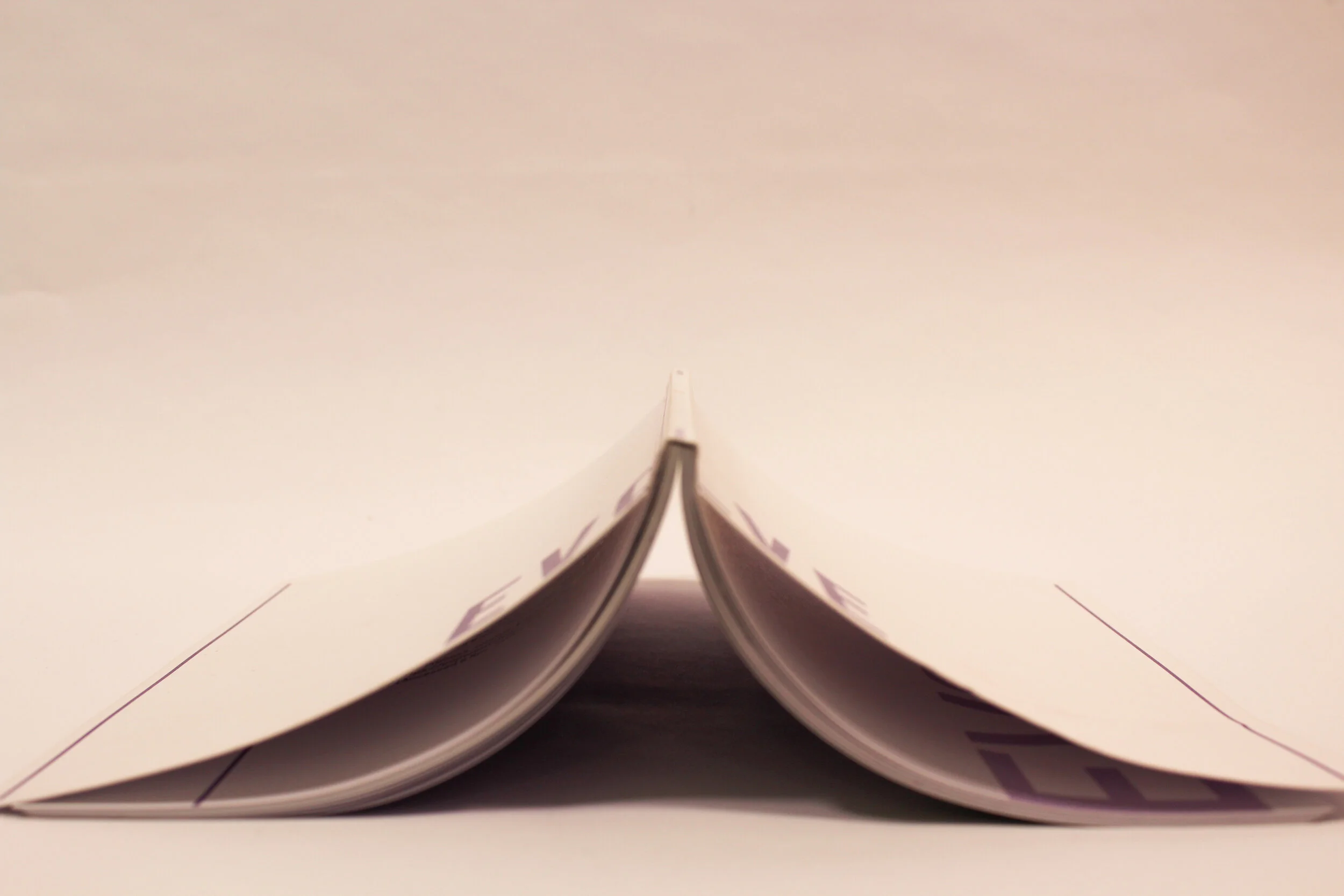
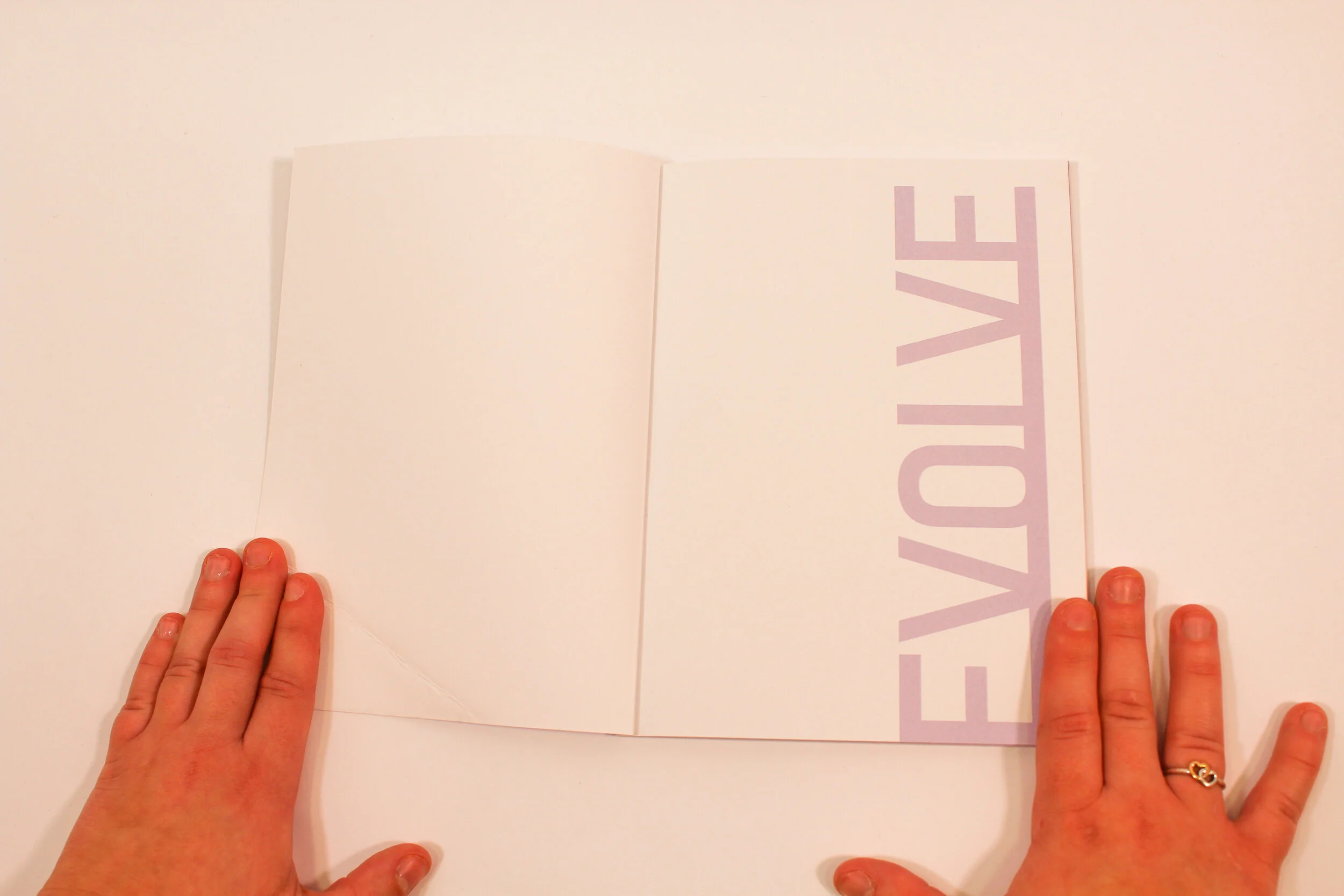
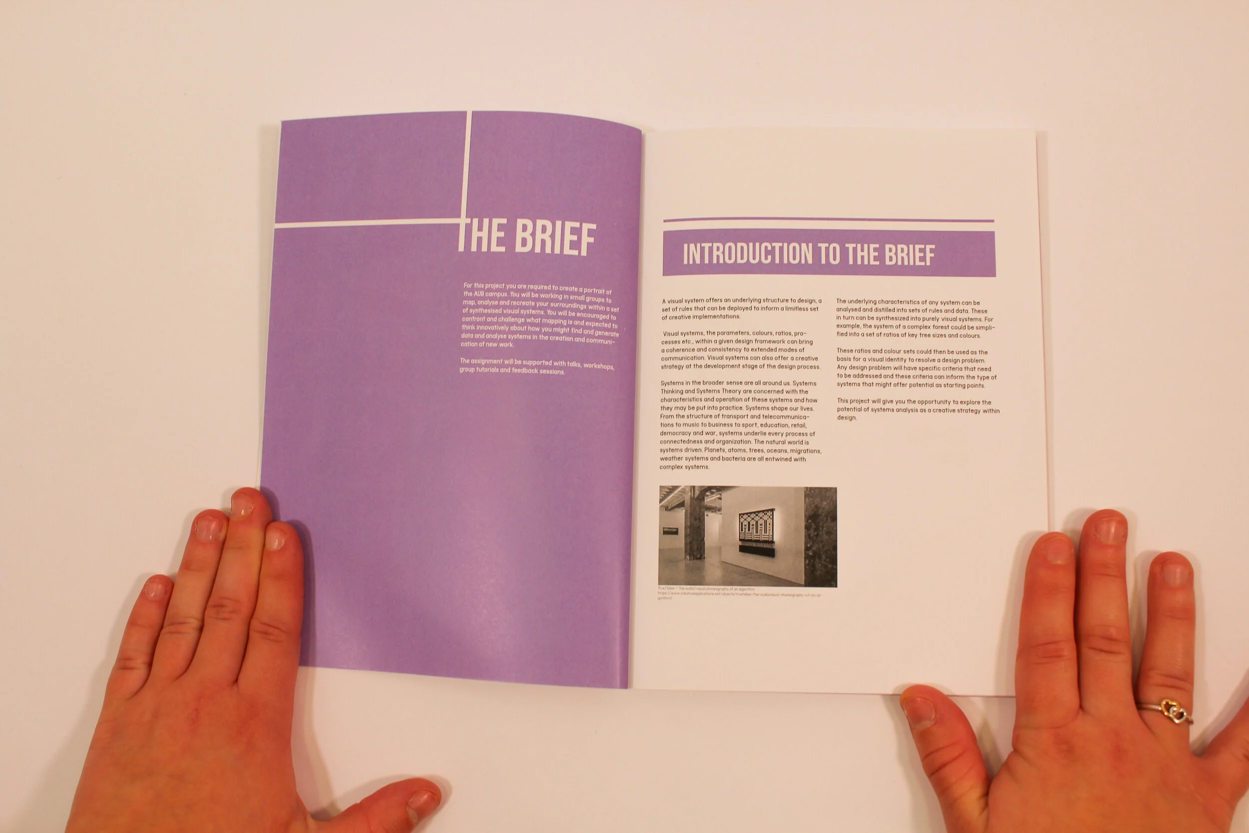
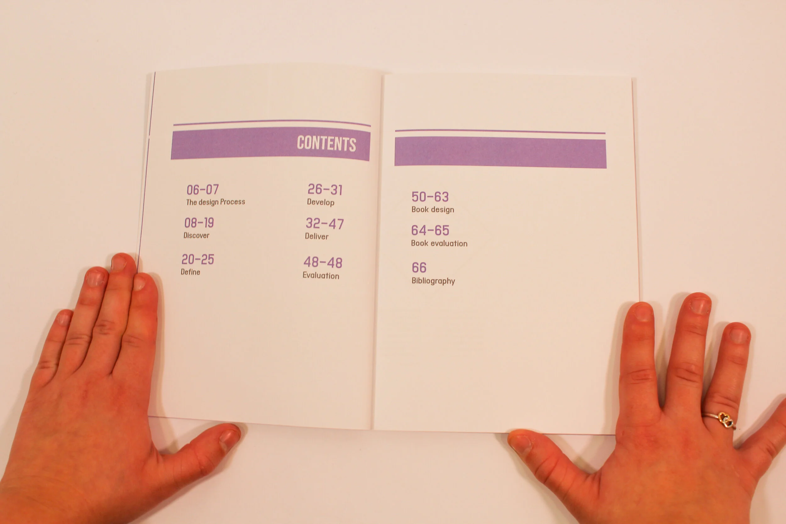
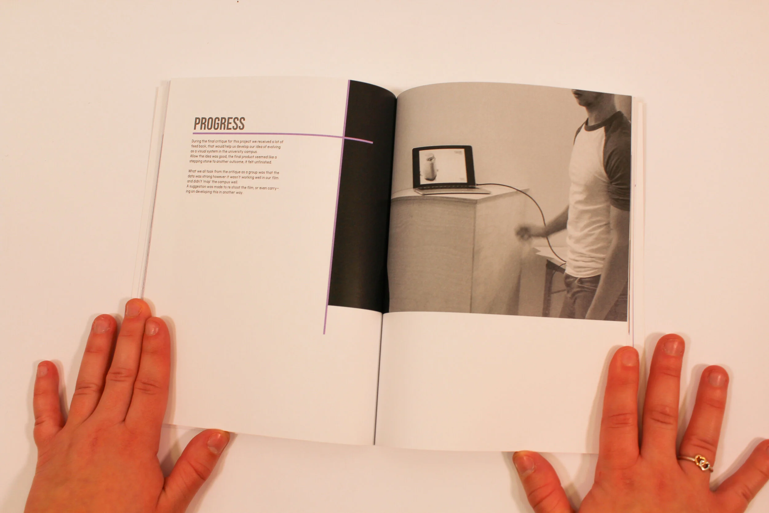
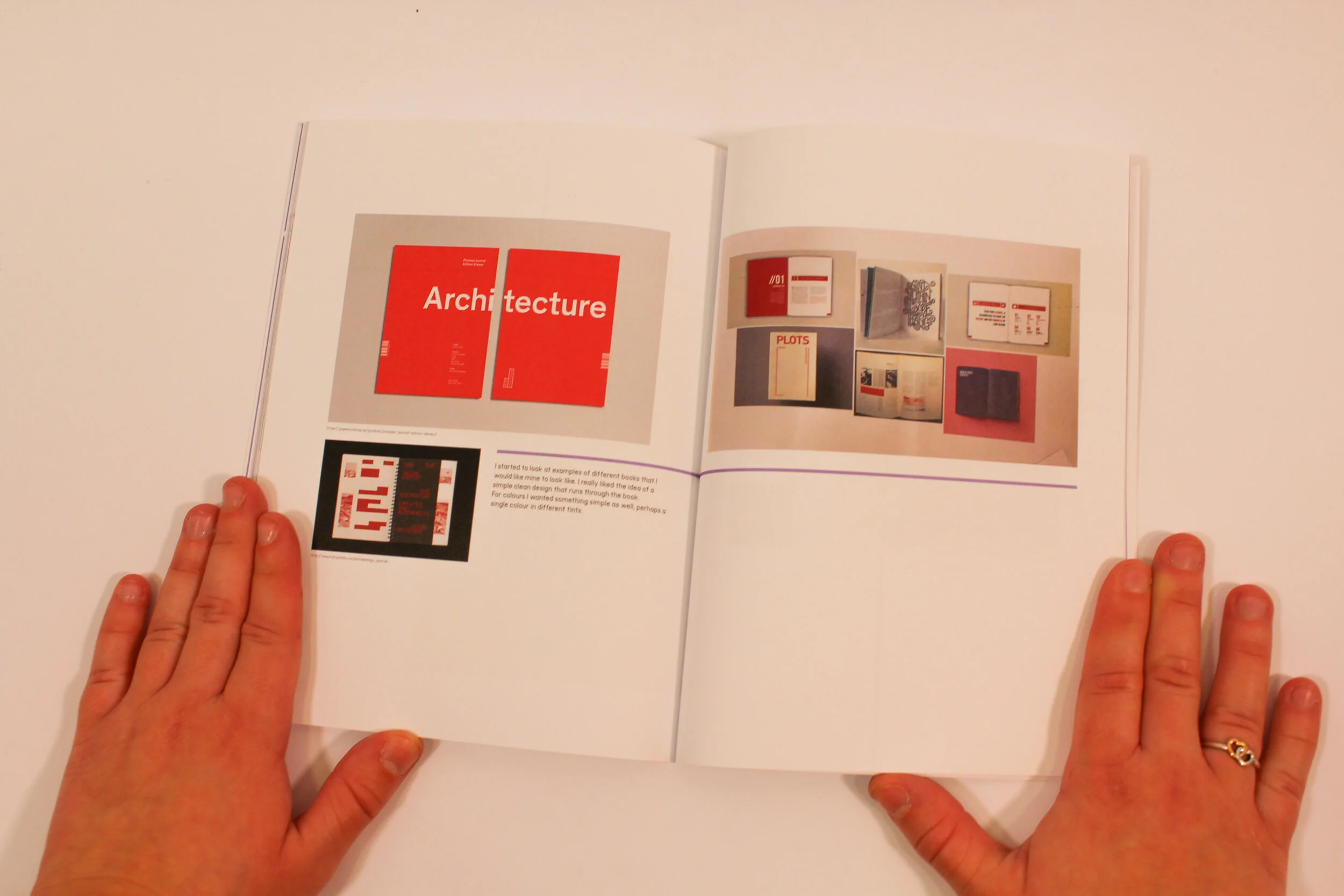
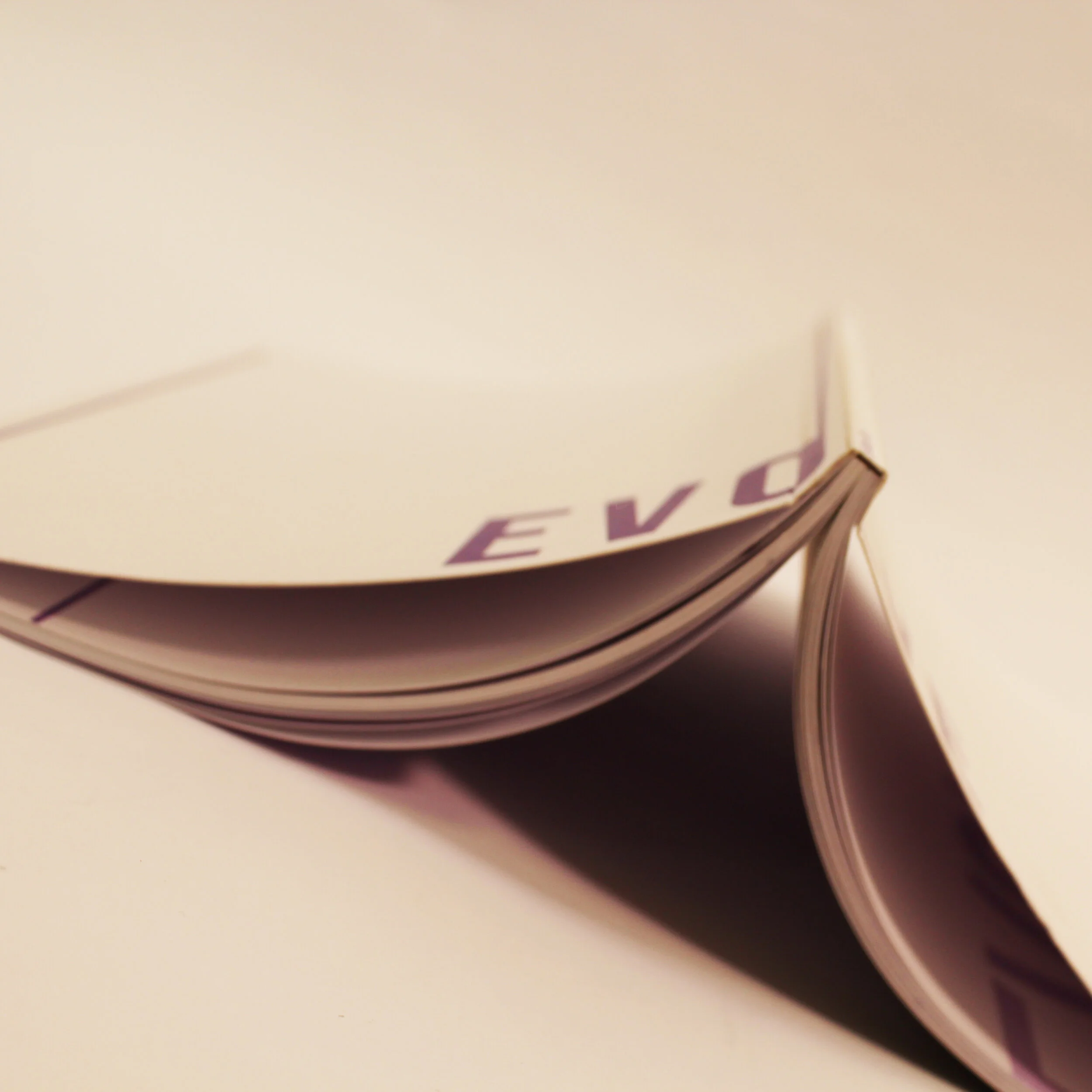
For this project I was asked to take my previous project ‘visual systems’ and create a perfect bound book with it as the contents. This was my first time making a book, I was very excited to start making and design my own book. When I first printed the book, I was very happy with the outcome, however looking back now I wish I had included more pages and spent more time looking into the materials. But overall, I am still very happy with my first attempt at a printed book. I choose to title the book Evolve as the contents focuses on the theme of evolving through AUB (arts university Bournemouth). I liked the idea of having the title spilt across the spine as it would make people look closer to see what it says and possibly be intrigued to open the book.
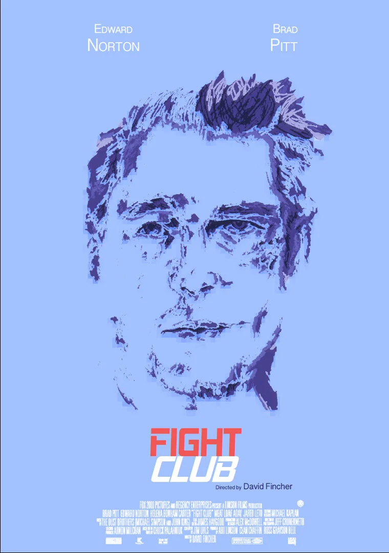
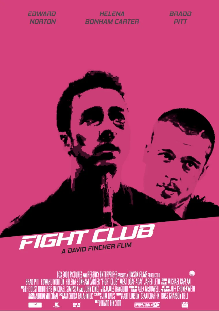
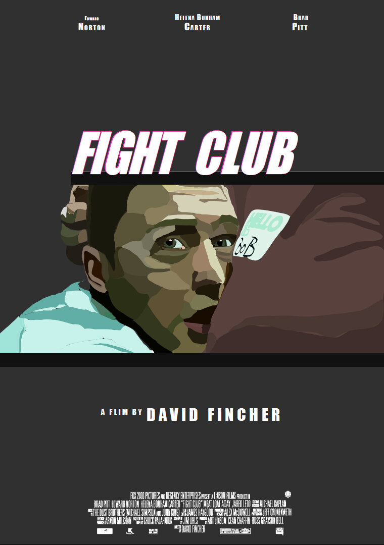
I created these three posters for a university project where i had to choose a movie (Fight Club in my case), and create three different genres of posters.(left to right) The first poster is a celebrity poster to showcase the celebrity, The second poster is a film buff poster for people who know a lot about the movie and the last is a genre poster so it plays to the genre of the movie. My favourite is the celebrity poster, however I am really happy with how all of them came out.
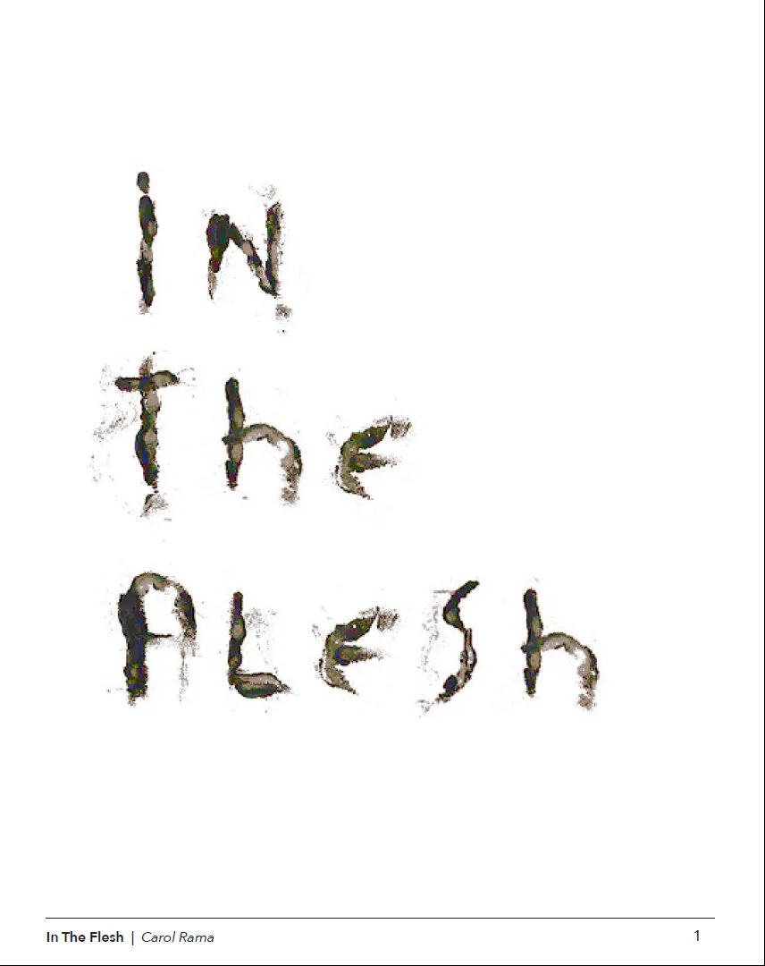
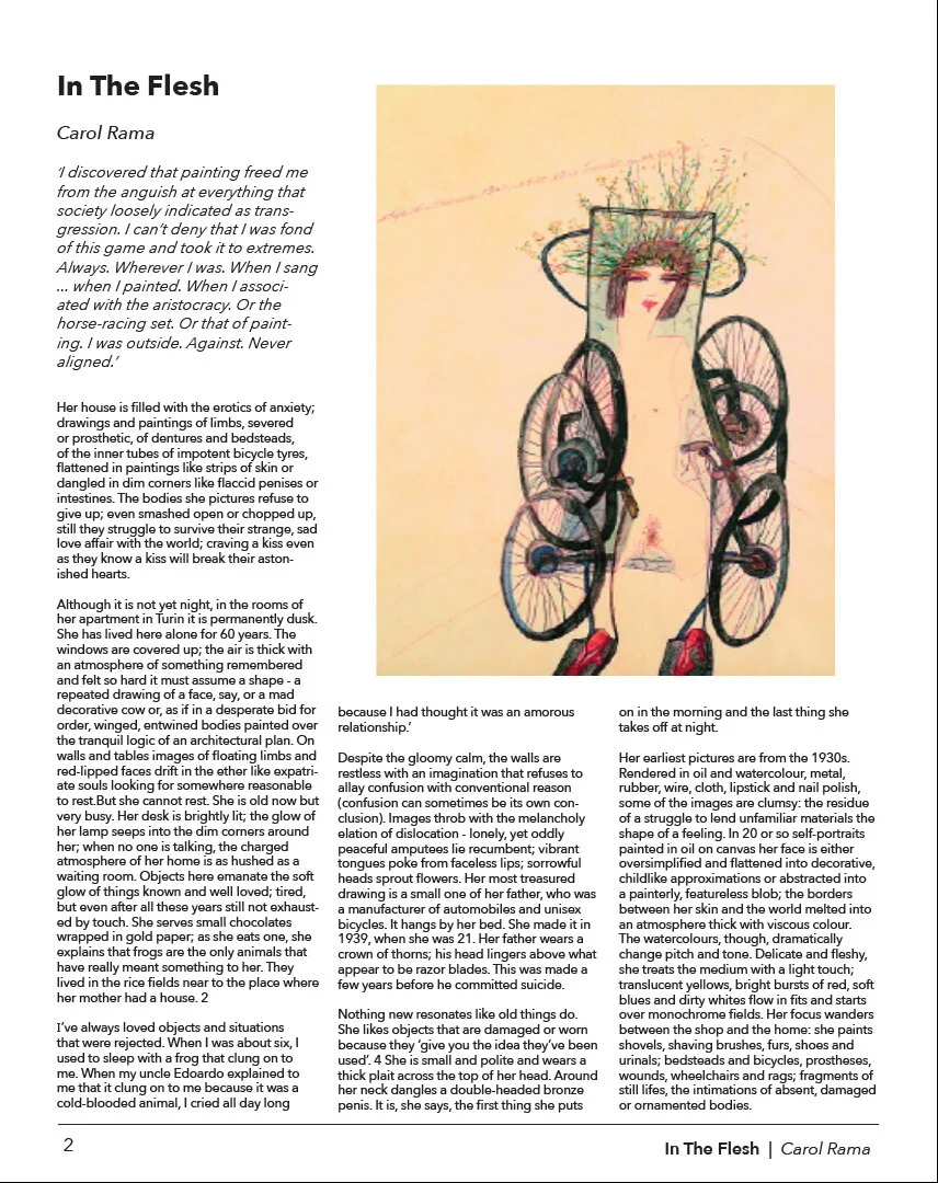
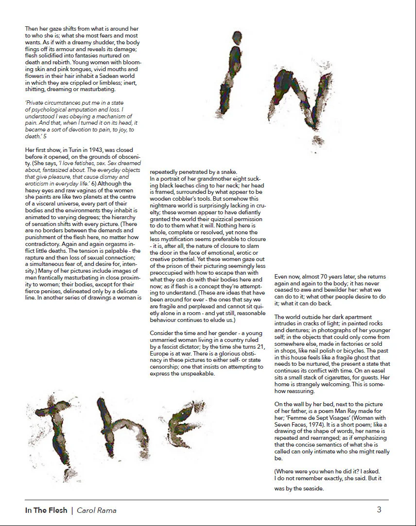
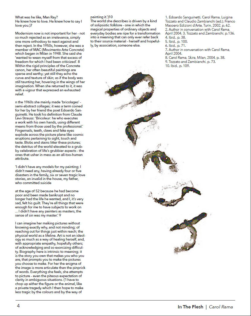
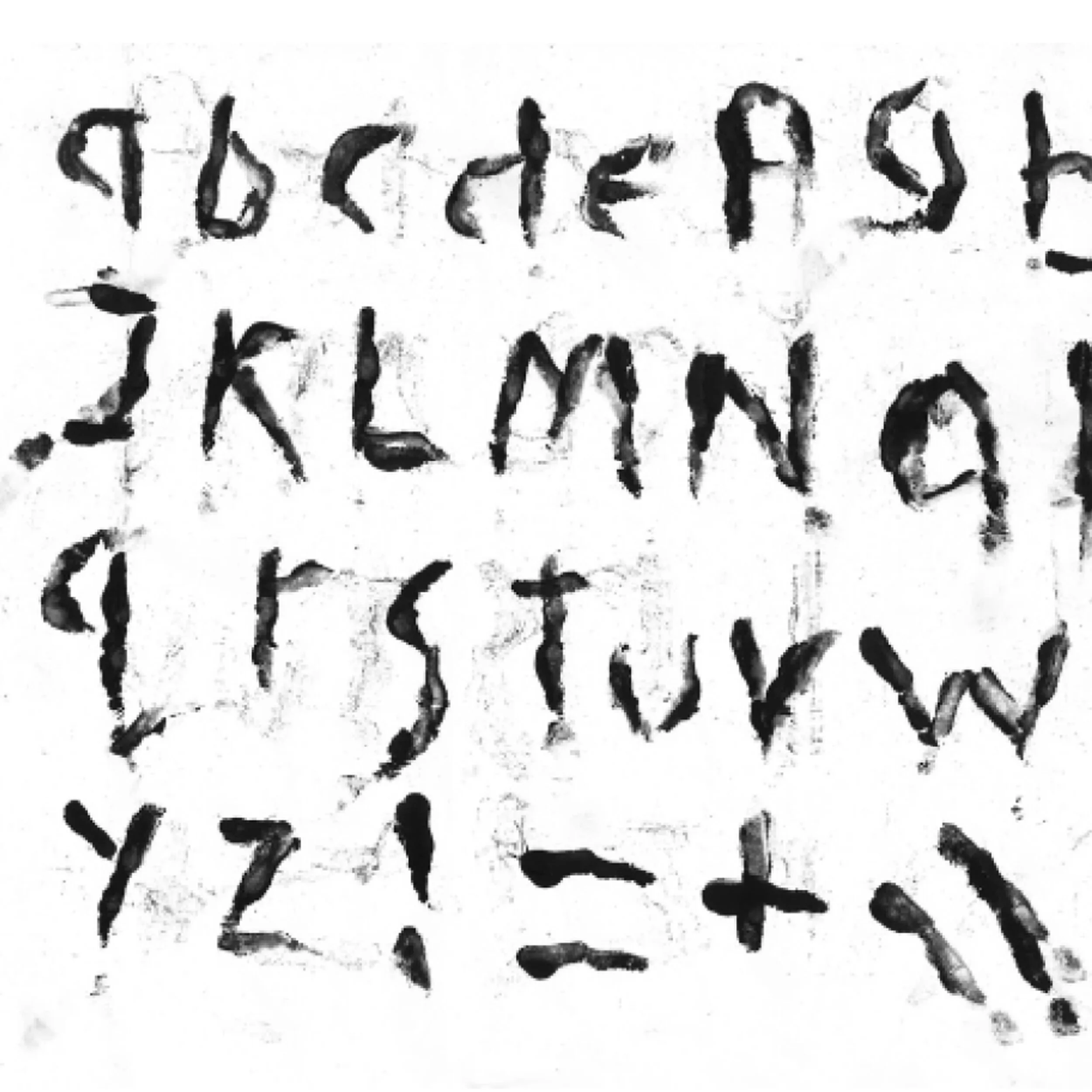
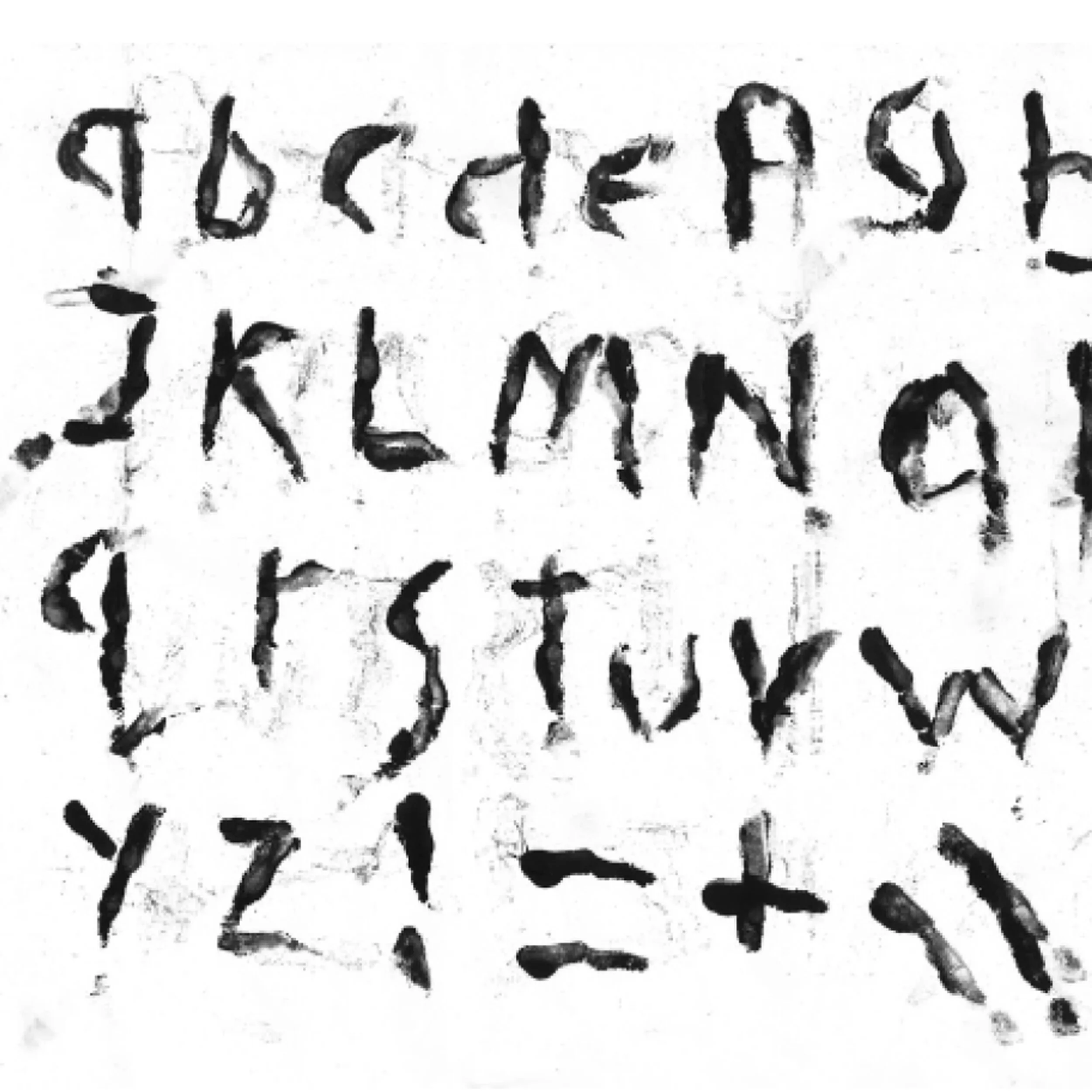
For this Magazine the task at hand was that we were to make a magazine article from the text within the magazine shown above. We must take in to account the artists style, and use the title 'in the flesh' as an starting point.I really liked working on this project as I was my first time creating my own type face, I did this by hand. It is quite a simple design however I wanted this to allow the text to speak for its self. Looking back at this project over a two years later, I can see my development throughout my course and experience in graphic design.